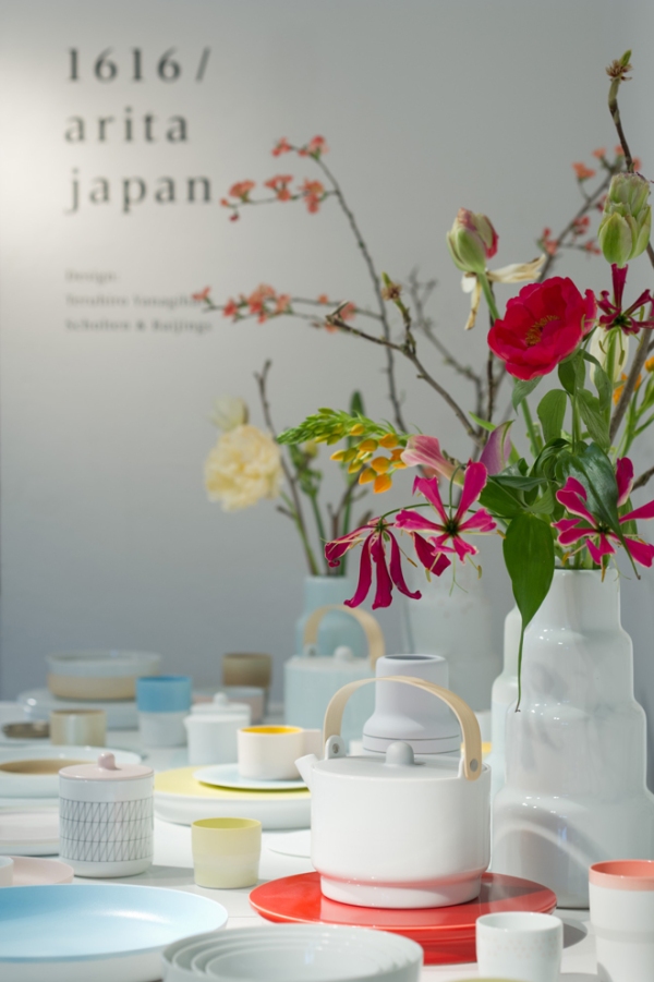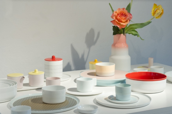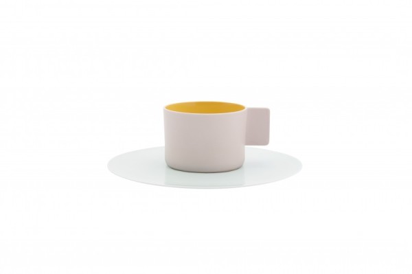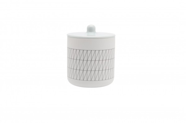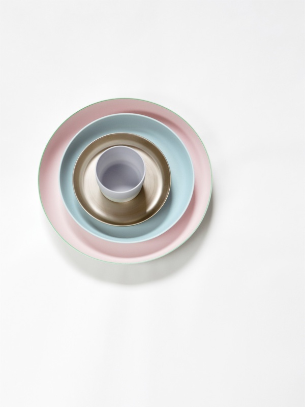
Dutch design duo Scholten & Baijings has created a colourful porcelain service for one of the oldest Japanese porcelain manufacturers, 1616 Arita. It was one of my favourite products on show at the Designs of the Year 2013 at the Design Museum. The collection consists of three series: Minimal, Colourful and Extraordinary, referring to the amount of colour, details and pattern used. In addition to pretty little plates, cups and bowls, each series also comprises serving platters, candleholders, vases and a tea set.
The ceramics use Japanese Arita porcelain, renowned for its delicate quality, grey-white hue and traditional hand-painted decorations. The tradition of porcelain painting dates back to 1616 (hence the name of the company), when the abducted Korean potter Yi Sam-Sam-Pyeong discovered a superior quality clay in Arita, Japan. Scholten & Baijings has used typical Japanese colours, such as aquarelle blue, light green, red-orange and yellow ochre in various compositions and shades of glaze. The collection combines East and West, with the petite shapes of a Japanese tea set, mixed with the retro patterns of 1950s and 60s European pottery.


Images: Inga Powillei