
This post has been a long time coming but it’s finally here – the reveal of my beautiful, light-filled minimalist home extension! I can’t quite believe we’ve got to this point and that it’s ours to keep – it feels like we’ve moved back into a completely new house. It’s been a journey to say the least (there’s not really any other word for it, as cliche as it might sound), but we’re here, and most importantly, I did it!! I planned and project managed a double storey extension, and somehow made my dreams come true. Can you believe it?!
The build took about six months, from moving out and welcoming the builders in, through digging the foundations and building walls, to building the joinery and adding the finishing touches. I think that seems pretty speedy for a double storey extension project. The whole process of conceiving the design, getting planning and refining the design to fit our budget took a lot longer – in fact it started as a seed of an idea when we first bought the property seven years ago and grew from there. The house already had planning for a side return extension when we purchased it, but we had to wait five years to be able to remortgage, and then I, of course, wanted to create a design that was more in-keeping with my aesthetic. I really wanted to create a completely tailor-made space that would suit the way we live.
You can see the before post here with the before and after plans. We’ve essentially knocked down a poorly built, single storey, ground floor extension that housed the only bathroom in the house, and replaced it with a generous, double storey, minimalist home extension that gives us a new dining/living space, as well as an extra bedroom and a new bathroom on the second floor.
I want to caveat this with the point that this space isn’t completely finished. Is it ever? I would still love to add a comfy cushion to the bench seat and maybe curtains to soften everything. I should probably add some art to the walls too! But for me, at least, I think it takes time to make a home and make a space your own – I think it helps to live in it and really work out what you want from a space. But I think this is as done as it will ever be and if I keep procrastinating more I’ll never show you this space in all it’s glory!
At the bottom of the post you will find my source list.
In today’s post I’m focusing on the interior of the ground floor extension, which has almost doubled the size of our downstairs. In subsequent posts, I will focus on the exterior, the flooring, the joinery, the upstairs rooms and I’m sure a lot more else besides! Let’s go…
[AD – this blog post features press products. All images Cate St Hill]


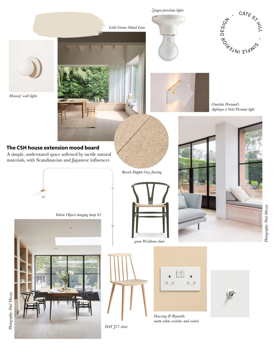
I thought I would share a reminder of the mood board and vision for the downstairs extension. The material palette for the interior is very soft, neutral and tactile, with off-white walls, Recork cork flooring, porcelain lighting and white sockets and switches. The only strong contrast comes from the black, minimalist Crittall-style doors opening up views to the outside.
The space is very much designed around peace and wellbeing – creating a calming sanctuary connected with the greenery of the garden. Before, the house had a very disconnected relationship with the garden. You had to go down the corridor and through an awkward back door to get to the exterior, not to mention that the bathroom was completely blocking the connection between the inside and out. Sometimes you could almost forget the garden was there! So it was very important for me to open up the space and blur the boundaries between interior and exterior. Now when you walk through the front door you get a view right out to the garden. And even on a grey day, you can have the back doors open. It’s completely opened up the use of the garden and brought a different feel to the house.


I think it’s important to note that I really wanted this minimalist home extension to be flexible and adaptable. Most people put their kitchen in their rear extension, but ours was already in the middle of the house, which works quite well because after all the kitchen is the heart of the home. So we have the cosy living room at the front of the house and the new extension at the back, sandwiching the kitchen in the centre.
This helps create a large, generous, new living area that can evolve with our needs. At the moment we have a young two year old, so it offers plenty of space to play and run around. I also shoot a lot of photography at home as part of my work, so it also enables me to move everything to one side and create a beautiful, bright photography studio.
Some people suggested using the front living room as a dining room but I didn’t want a traditional space that dictates how you use it. I instead wanted a more informal, relaxed space with a built-in dining bench and window seat that can be used for eating, but also for working, or playing, or reading, or watching TV, or any other manner of things. I think the way we’re designing spaces is changing and the freedom to make a space your own is so important.
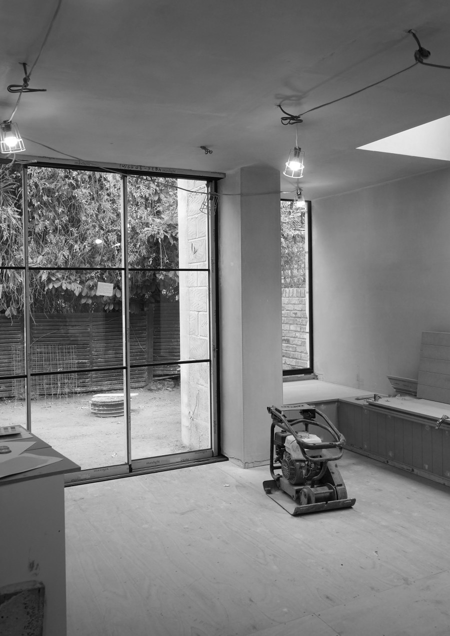
Here are a few process shots as the build reached the final stages.


And here’s the finished space – our bright minimalist home extension designed around wellbeing, creating a soothing sanctuary to feel relaxed and at home. I’m going to take you through a few elements step by step.
The glazed doors
I chose floor to ceiling sliding doors from Maxlight and I absolutely adore them. They have the slight look of Crittall with the black bars, but they’re made of aluminium and come in a lot cheaper than steel. I love the minimal handle detail – there’s a discrete lock on the side and the handle is almost part of one of the vertical bars. The doors also open from both ends, which adds another element of flexibility. I’m really glad I went for three panels in the end, because it creates a bigger opening when they’re all pushed to one side. We also have a fairly small garden so I didn’t want the doors to open out and eat too much into the space. When the doors are pushed open they create such a seamless transition between inside and out.


The window seat
From the off, I knew I didn’t want one big wall of glazing. I just think it looks a bit one dimensional and lacks nuance. I wanted to create a stepped facade with a window seat to create a moment of intrigue and a cosy place to sit and admire the green backdrop of the garden. This would be my little reading nook where I could retreat with a cup of coffee or glass of wine at the end of the day.
I designed the window seat and the joinery bespoke for the space, creating mood boards and plans with measurements for the builders to bring to life and make a reality. I think it really helped knowing exactly what I wanted. I made the window seat quite deep so that you can really put your feet up and get comfortable. We had a bit of a hiccup during the process where the window seat narrowed in width because Building Control required us to add more insulation, but I’m embracing the cosy!


I think the details are what make a space so I made sure that all my finished matched and tied together, from the white toggle switches to the minimalist lighting. I chose porcelain Zangra lights for the ceiling as I didn’t want cold, clinical recessed ceiling lights, then I managed to grab my dream lights (Charlotte Perriand’s Applique à Volet and Muller van Severen’s lamps for Valerie Objects) in the Black Friday sales.


The joinery
I designed a zone of storage that would connect the kitchen to the new extension space, to house a pantry cupboard, hallway storage and space for our washing machine. This then extends into a four metre long built-in bench before wrapping around to become the window seat.
The joinery was bespoke made using MDF by our builders. The seat lids lift up to conceal plenty of storage below. Our builders routed the lines into MDF panels to give a minimalist take on tongue and groove. I love how it adds texture to the joinery and gives a relaxed, Australian kinda vibe!
That was a lot of joinery for me to paint. I think it took about four coats of primer and six coats of Eggshell – painted in the same Portland Stone Pale by Little Greene to match the walls. It was so worth it though.


I’ve deliberately kept the space quite simple so that it can act as a blank canvas that we can make our own. The result is pared-back, focusing on less, but better. I’ve put a lot of thought into the little details that really make a difference to the overall feel – from going over and over the electrical plan to perfect it, to pairing similar tones and textures to create a cohesive look. I think my motto would be to invest in the basics, and the rest will follow with time.
And you know what, looking back, I really enjoyed the process. I went into the project feeling daunted and nervous, but I’ve come out of it wanting to do another one. I was even sad when it was finished! I think some of that comes down to having a good collaborative relationship with your builder, based on trust and clear communication, but a lot comes down to knowing what you want and being decisive in the moment. I had a strong vision in my eye and that helped lend an element of focus to the project.
If you’re starting a project like this, I would recommend getting as organised as you can. I had a spreadsheet with every fixture and fitting before we were even on site. I changed my mind on a few things during the build, and at some points the decisions felt overwhelming, but it gave me a good start and foundation to build on. Finesse your electricity plan and think about how you’re going to be using the space day to day. Have lots of lists and write everything down. Sometimes I found it hard just to remember everything, but then I was having to manage every single thing on my own, from the design decisions to the ordering of things and managing the budget. My builder was a huge support in meeting with Building Control, managing the different trades and making sure it was all going to schedule. I know I literally couldn’t have done it without them, but they really made the project what it was. I would visit site every week, but I also had a WhatsApp group with the builders so we could exchange ideas, suggestions and updates.
I’m overjoyed with the result and I couldn’t have asked for more. The space is so bright and airy – and now I can really see the influence that natural light has on your wellbeing and mood. We’ve moved in at the perfect time of year to enjoy it in the Spring and Summer. I wake up to a mood-boosting bathroom and come down to have my coffee in a space flooded with the most beautiful dappled light. It’s a dream come true.
My next post will focus on our beautiful Recork flooring and why we chose cork in particular.
Sources (*indicates a press product):
Architect: Scenario Architecture
Interior design: Cate St Hill (moi!)
Engineer: Baker Chatterton
Contractor and joiner: Polstar Group
Glazing: Maxlight
Flooring: Recork in Dapple Grey*
Paint: Portland Stone Pale by Little Greene*
Wall lights over the dining table: Valerie Objects
Wall lights over the sofa: HouseOf
Ceiling lights: Zangra
Sockets and switches: Dowsing & Reynolds*
Outdoor tiles: Ca Pietra*


Pingback: [Ad] Why I chose cork flooring for my extension project – Alphagd
Pingback: [Ad] Creating a new look kitchen with Superfront fronts for IKEA kitchens – Alphagd
Pingback: [Ad] Creating a new look kitchen with Superfront fronts for IKEA kitchens
Pingback: [Ad] Why I chose cork flooring for my extension project