

Dim House 1, coloured pencil and graphite on paper, 2012. A depiction of a blind building.
Toronto-based illustrator Tom Ngo creates drawings of absurd structures and follies that turn common perceptions of buildings on their head. By taking typical buildings, embellishing and repeating elements, Ngo blurs and alters the purpose of the original structure. I like how fantasy and humour is combined with the technical precision in his drawings, so I was keen to find out more about what inspires him…
Whats your background? How did you end up doing what you are doing now?
I’m architecturally trained and am currently a practicing intern architect at Moriyama & Teshima in Toronto. I started these drawings around the time I was developing my thesis around 4-5 years ago. It stuck with me after school and have since exhibited the work extensively in Toronto and New York.
Dim House 2, coloured pencil and graphite on paper, 2012. A depiction of a blind building.
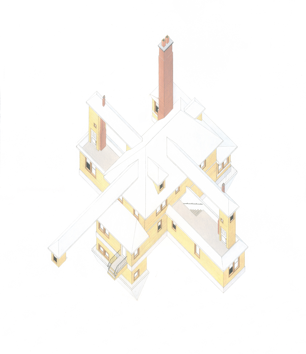
Haunt of Limbs, coloured pencil and graphite on paper, 2013. This building expands upon itself. Each extended piece creates duplicates parts of the whole.
What inspires your drawings?
The drawings started very simply by trying to counter-logic within architectural design. Common-sense isn’t always your best friend when designing because it leads you to do things that are expected without considering other possibilities. While I’m working at the office, I’m constantly thinking about how and why I’m making particular design decisions and when I’m home, I try to experiment with them deliberately making a few “wrong” decisions and then developing the work from that.
How does your design process work?
I take a lot of pictures of buildings when I encounter them. Not of anything weird but of really standard looking buildings. I’m fascinated by them and their regularity. Sheds, Houses, Office buildings, the more “normal” the better. I like to experiment with those because it’s easier to transform. I then usually sketch weird transformations into those buildings, contorting them, pushing and pulling here and there. Then they pass through a drafting stage when I translate the sketches either directly to paper or when I’m working on larger drawings I’ll convert them into AutoCAD before redrafting on paper. It helps me compose the drawing without having to erase large swathes of it. Each phase of course has a lot of experimentation so final drawing doesn’t usually look like the original sketch.
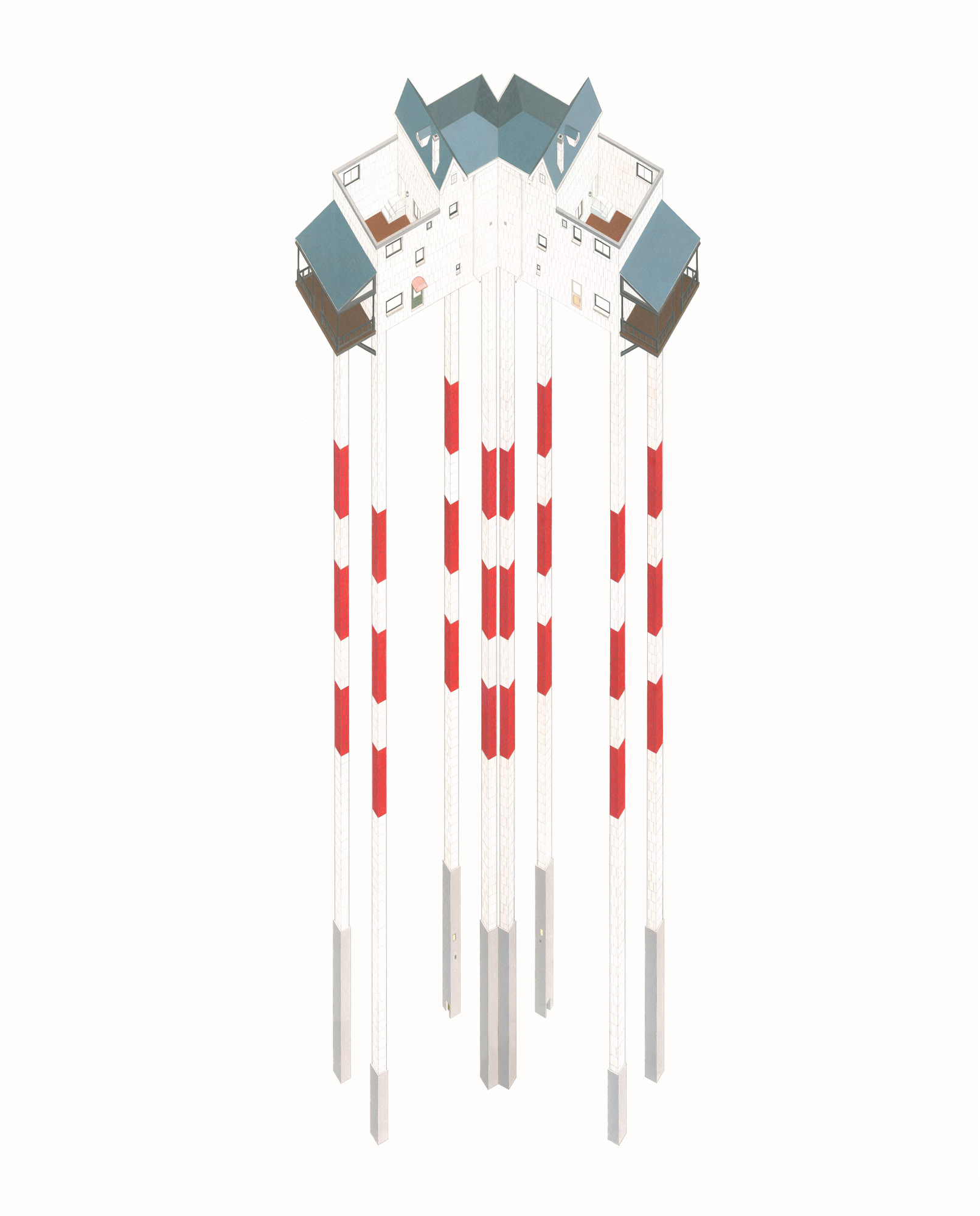
Minotaur, coloured pencil and graphite on paper, 2013. A building of a maze of stairs.

The Crucible, coloured pencil and graphite on paper, 2012. A drawing of a “perfect community” in all its flaws.
What can we look forward to next in the architectural absurdities series? Or do you have other ideas up your sleeve?
Absurdity is just the start really. I’ve been fascinated with the notion of redundancy recently. I think it’s all part of some strange umbrella which I think leads me to dealing more specifically with the aesthetically grotesque. I’ve been experimenting with form and I’m looking forward to the next body of work in which I’m trying to translate a few moments within the drawings into installation and manifest it physically. There is a definite experience that I try to evoke within the drawings and I’m hoping that dealing with a space at 1:1 will help me define that experience a little better.
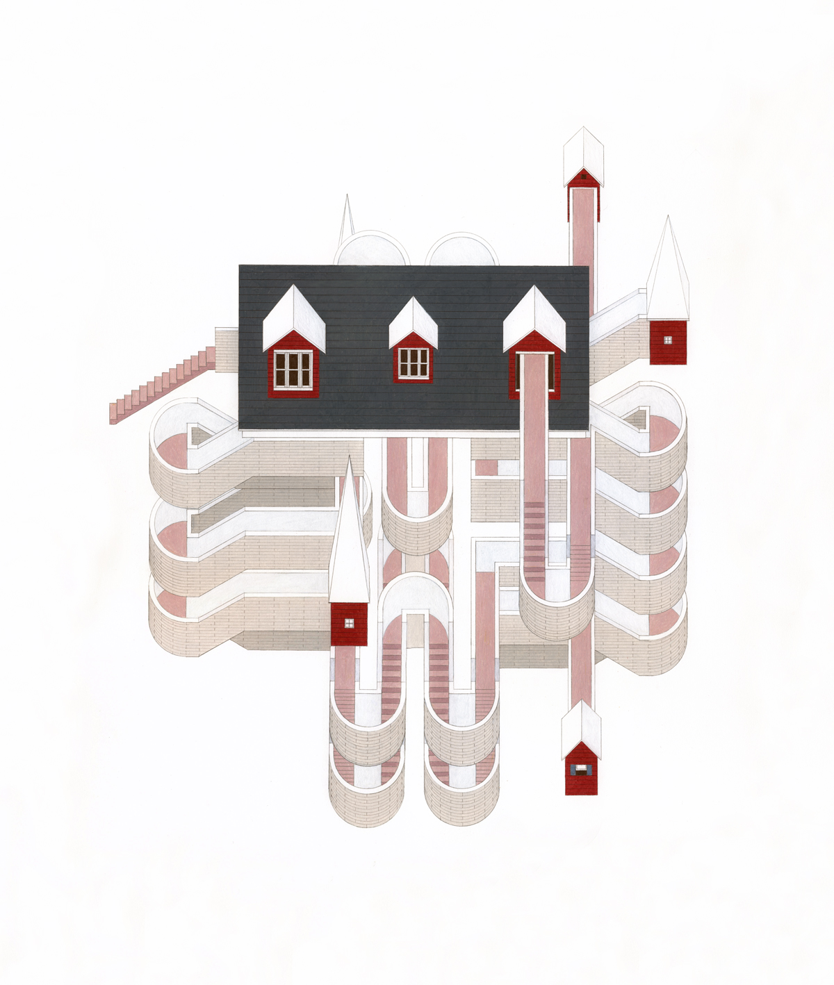
Chalky bones, coloured pencil and graphite on paper. 2012. A play on the lighthouse typology.
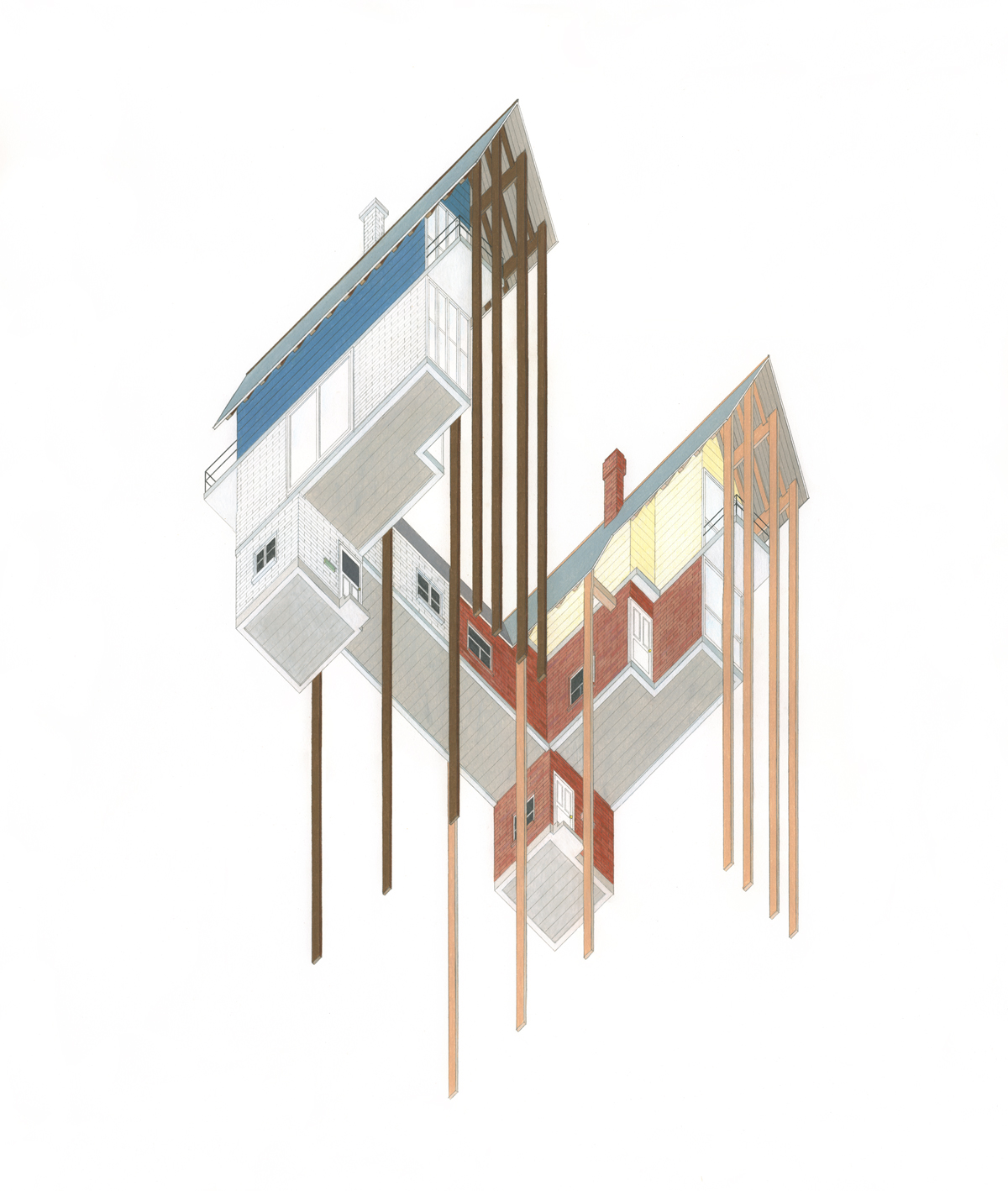
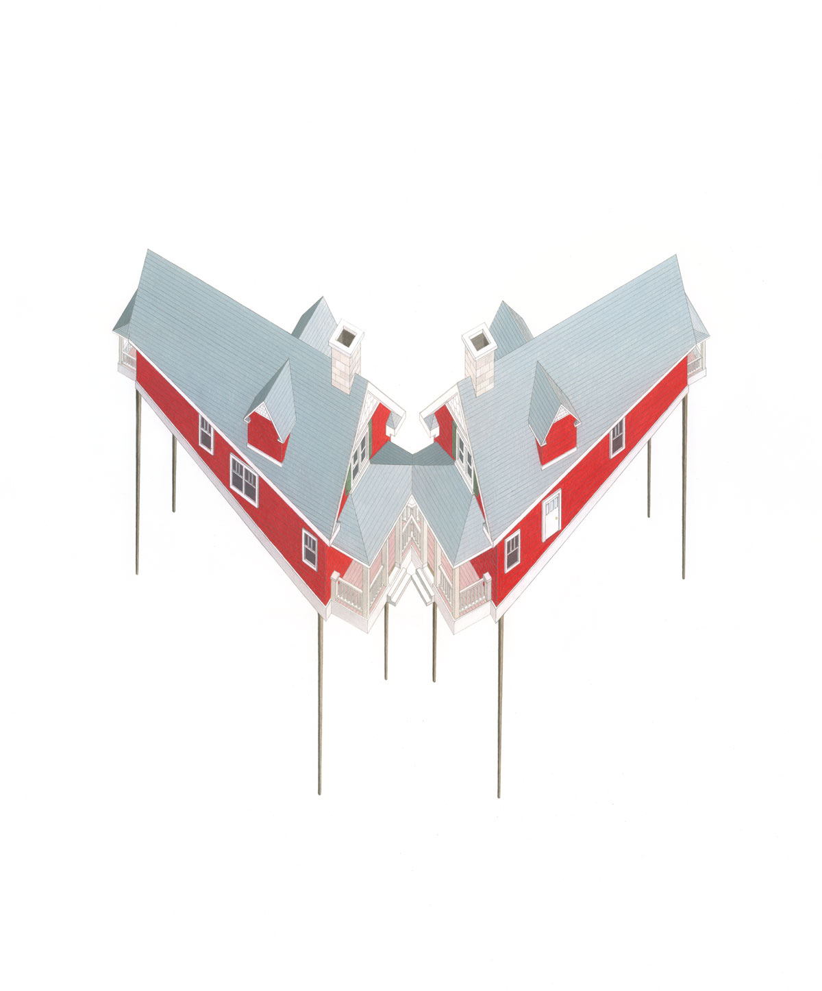
Semi-detached, coloured pencil and graphite on paper, 2013. A building of a semi-detached house even further detached.
Six of the images are part of an exhibition titled ‘Fun and Whimsy’ at the Nancy Margolis Gallery in New York until March 23.


