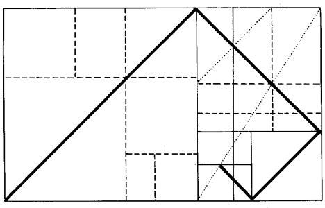
Whilst watching ‘The Secret Life of Buildings’ with Tom Dyckhoff on Channel Four, I decided to write about one of the features on the programme; the golden section. The golden section is an ideal in architecture where the proportions of the building are determined by a ratio that makes the design aesthetically pleasing. The golden ratio is an irrational mathematical constant, approximately 1.6180339887, for example with a rectangle, the ratio of the longer side to the shorter is the golden ratio. The golden section can be seen in nature, for example in the coil of a shell, the vertebrae of an animal and the veins on a leaf. Leonardo da Vinci also used the golden section in illustrations of polyhedra in De Divina Proportione (On the Divine Proportion) to demonstrate the proportions of the human body. Architects have been using the golden section to rationalise their designs and in a search to create the most pleasing buildings to the eye. Le Corbusier was one such advocate; “rhythms apparent to the eye and clear in their relations with one another. And these rhythms are at the very root of human activities. They resound in man by an organic inevitability, the same fine inevitability which causes the tracing out of the Golden Section by children, old men, savages and the learned.”
Leonardo da Vinci’s polyhedra
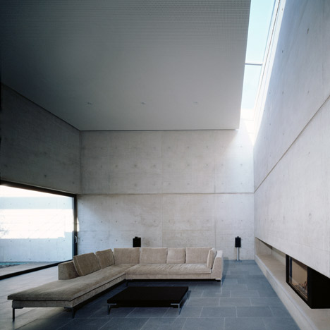
In the ‘Secret Life of Buildings’, the design of Bateman’s Row by Theis and Khan Architects was explained through the illustration of the golden section. In addition, I was attracted by another example below; Absalon by German architects Denzer & Poensgen. This house in Trier, Germany, features raw exposed concrete walls and facade, which divide the house into three volumes with an atrium in the middle. The size of the rooms and elements was determined by the golden section, which creates a well balanced home between the private and the public; “The house resembles a clearly structured organism, containing streets, courts, passages, and open and enclosed spaces. The house as an image of a city.”
Images: Dezeen


