The ‘central hub’ of the ten-day London Design Festival 2013 is the V&A, where you can find installations, events, talks and workshops around the theme of ‘design is here, there and everywhere’. Highlights include an impressive eight-storey light installation in the main entrance by Canadian designer Omer Arbel and a trail of Swarovski lenses focussed on the design details of objects across the V&A’s collections. For the first time there are also themed days to help visitors navigate around the vast museum.
Here I take you through some of the best things to see.
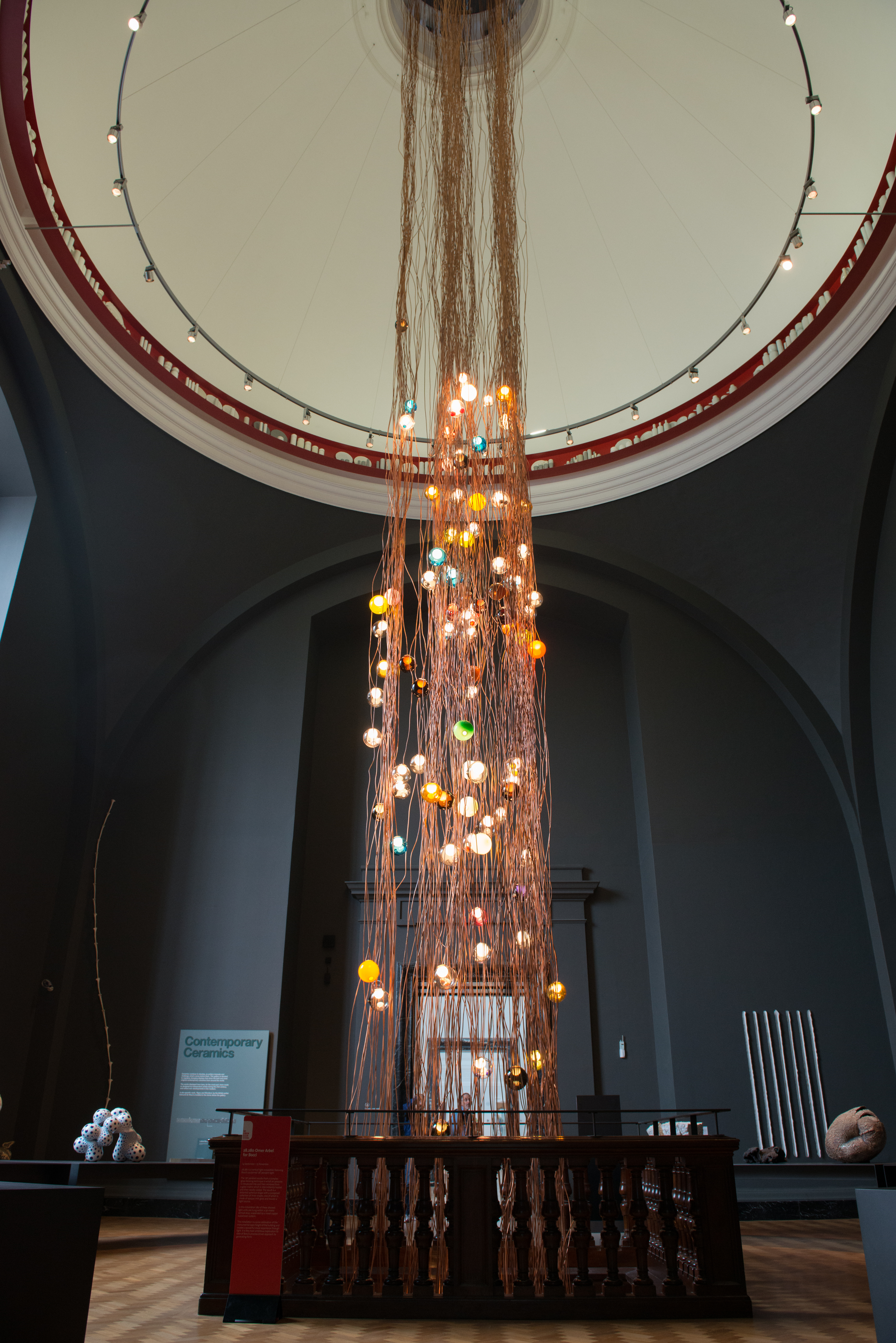
28.280 by Omer Arbel
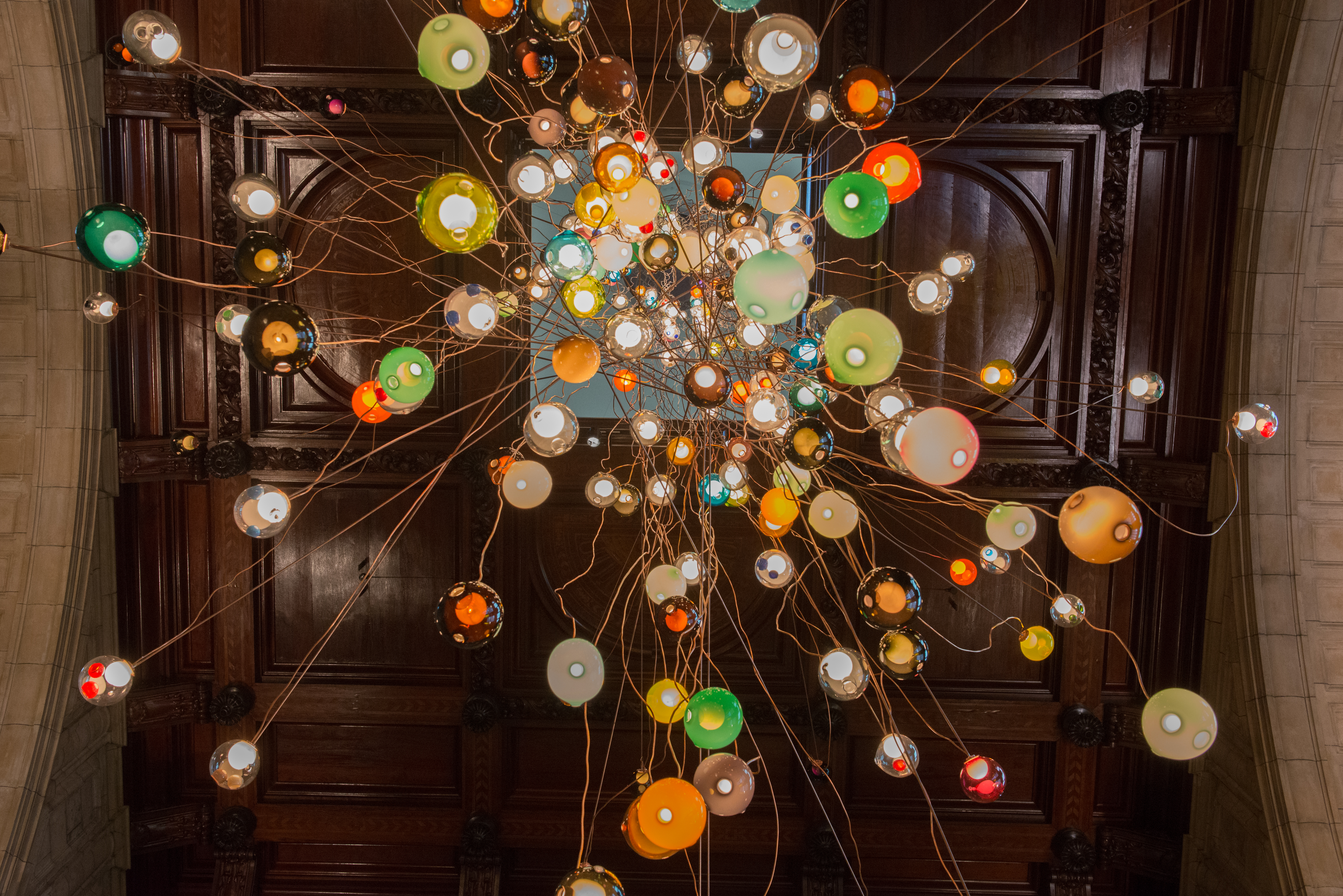
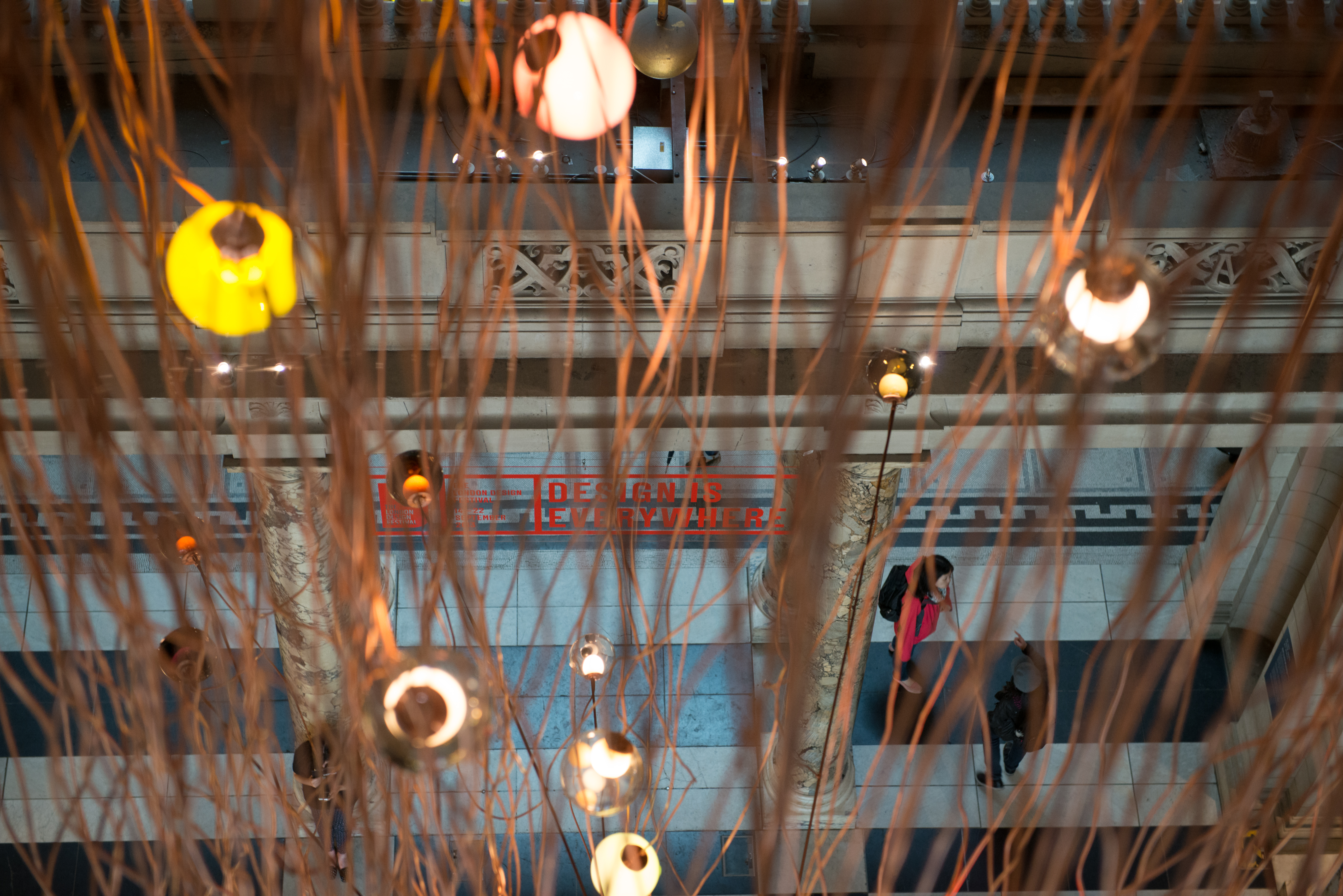
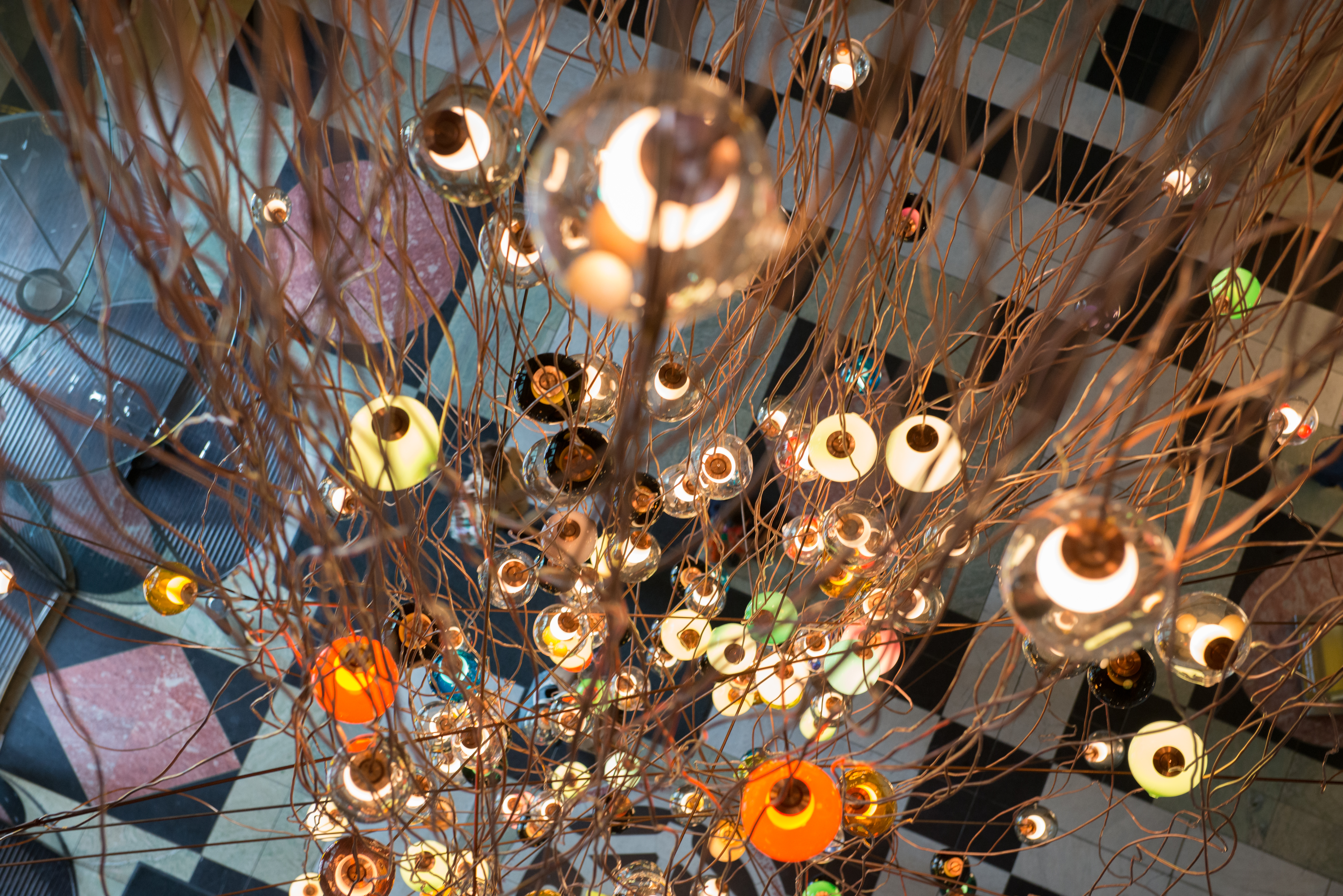
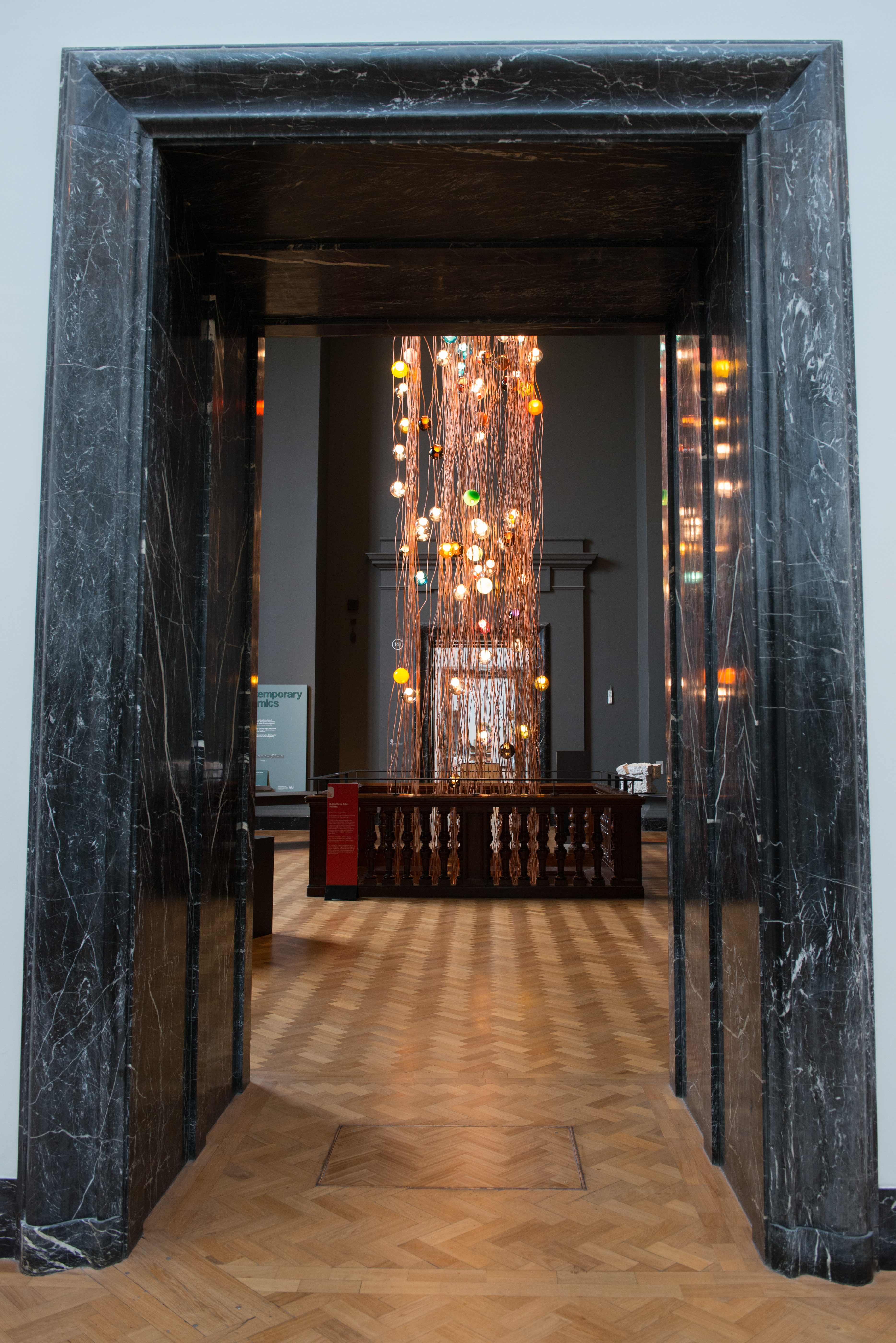
The first installation you come to at the V&A invites you to look up at a 30 metre tall copper and glass sculpture by Canadian-based designer Omer Arbel. The sculpture hangs through the centre of the ceramics galleries, past the coffered ceiling beneath and finally appearing above the main doorway as visitors enter the museum. Arbel told visitors at last week’s preview: “I didn’t have any preconceived notion of what it would look like, I just let the copper and glass do what it wanted to do”.
The installation is made up of 280 individual 28 Series glass pendant lamps that are each suspended from the cupola – the highest point of the V&A. Every pendant is handmade at design brand Bocci’s glass factory in Canada using a fabrication process developed by Arbel.
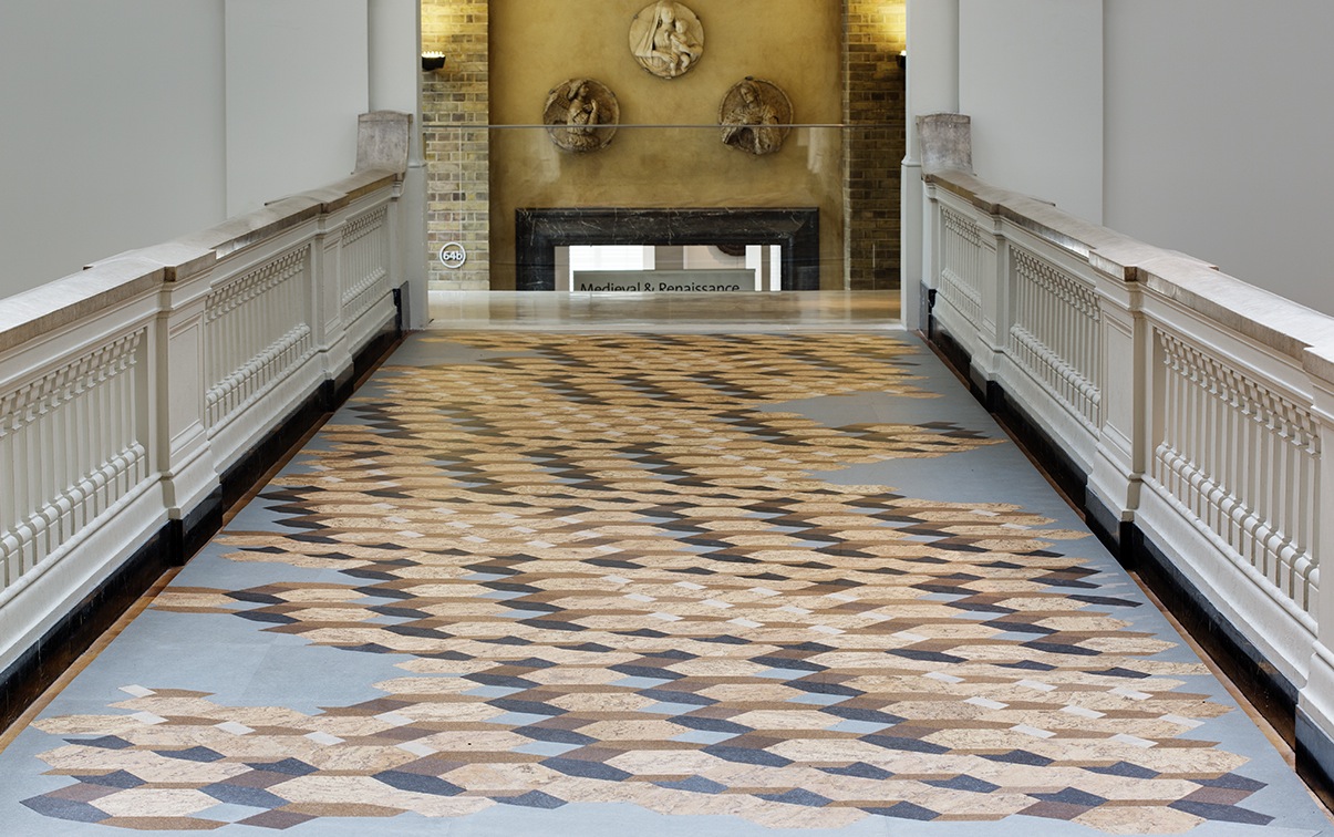
The progressive extension of the field of individual development and experience by FAT
FAT Architecture has designed an installation made of cork that occupies the existing bridge over the V&A’s Medieval Galleries. The installation, comprised of a series of tiles laid in a geometric pattern, aims to challenge the existing connotations with the material. The pattern is based on the material’s cellular structure when seen under a microscope and appears like the fragments of an old roman floor.
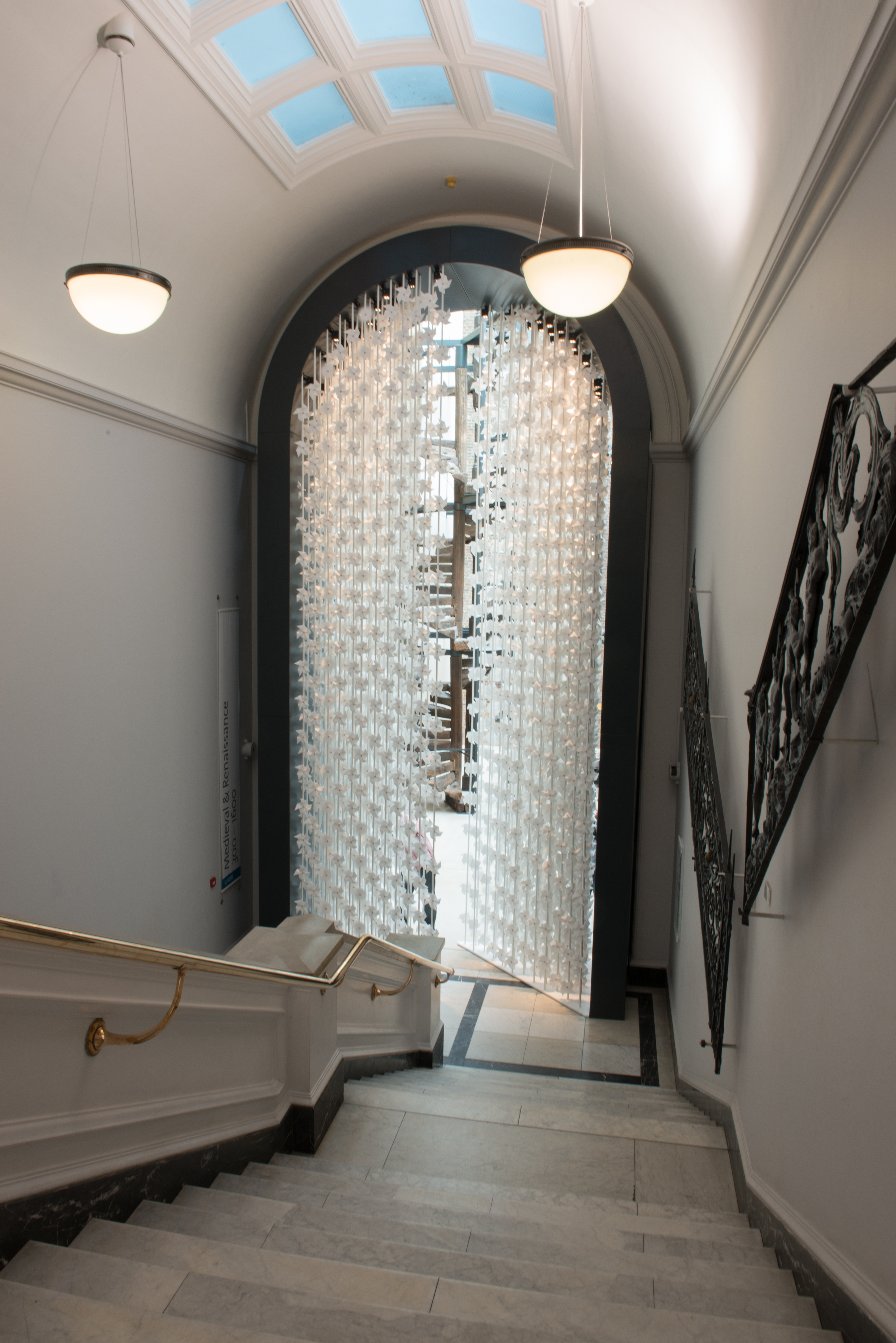
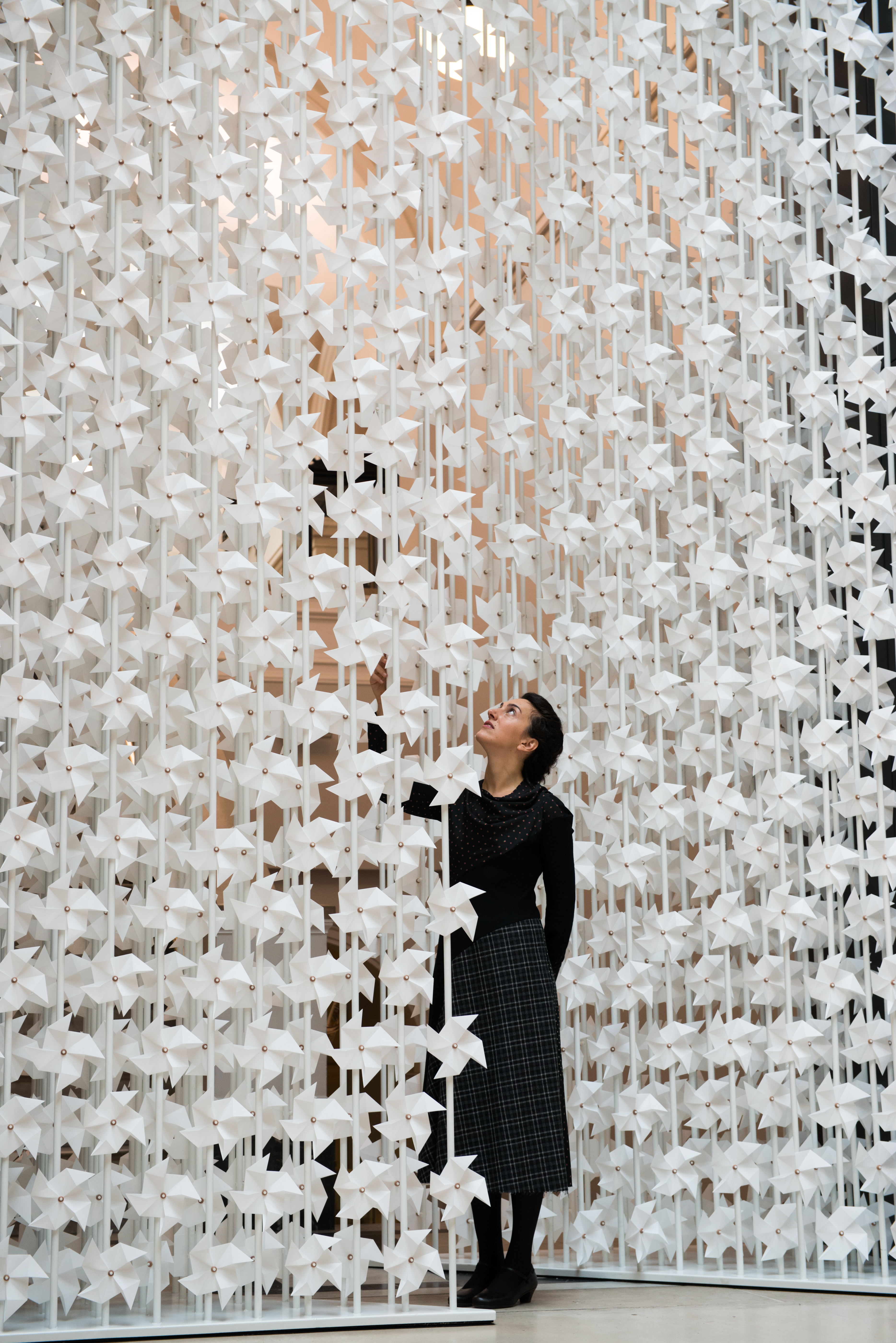
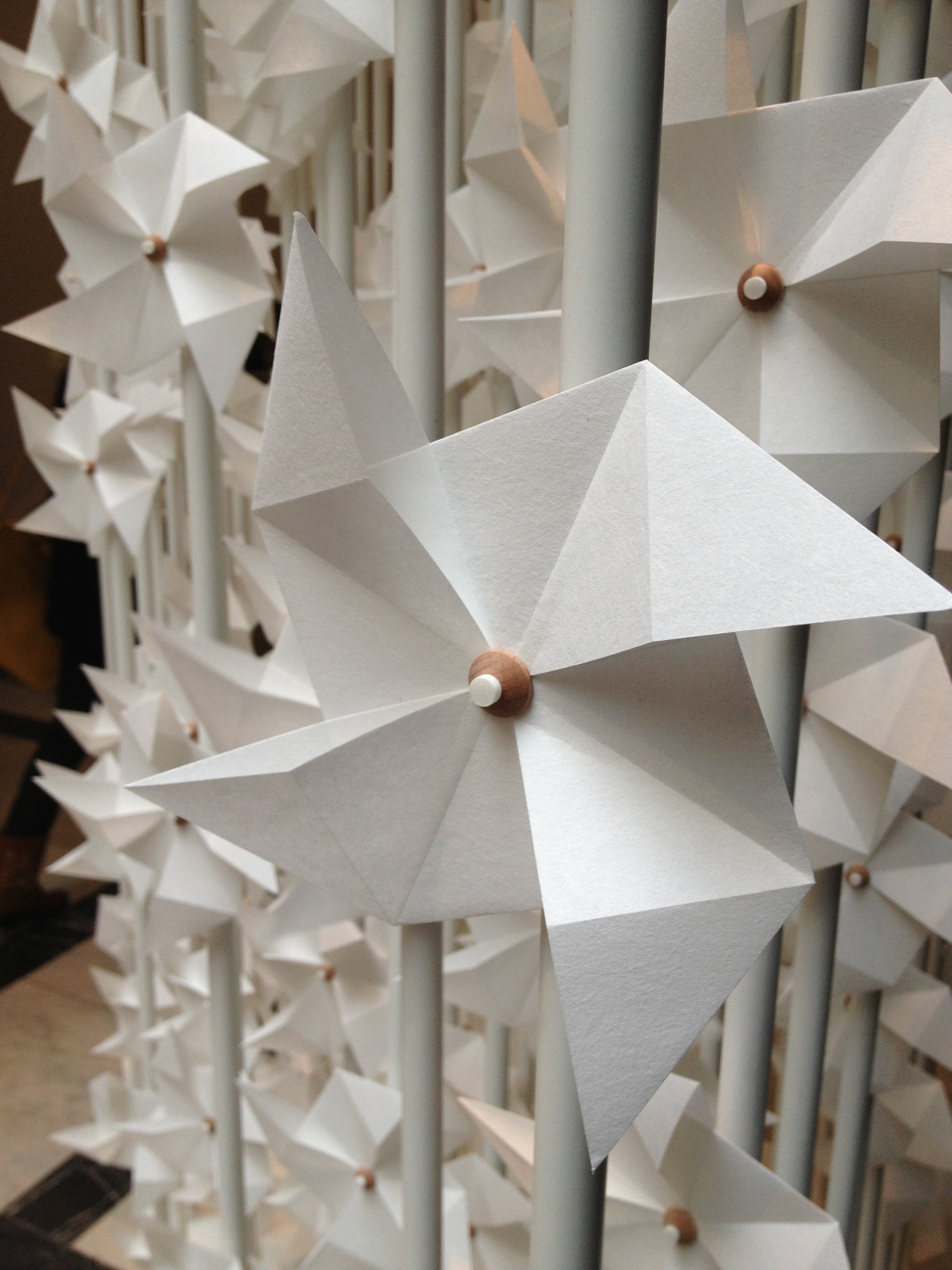
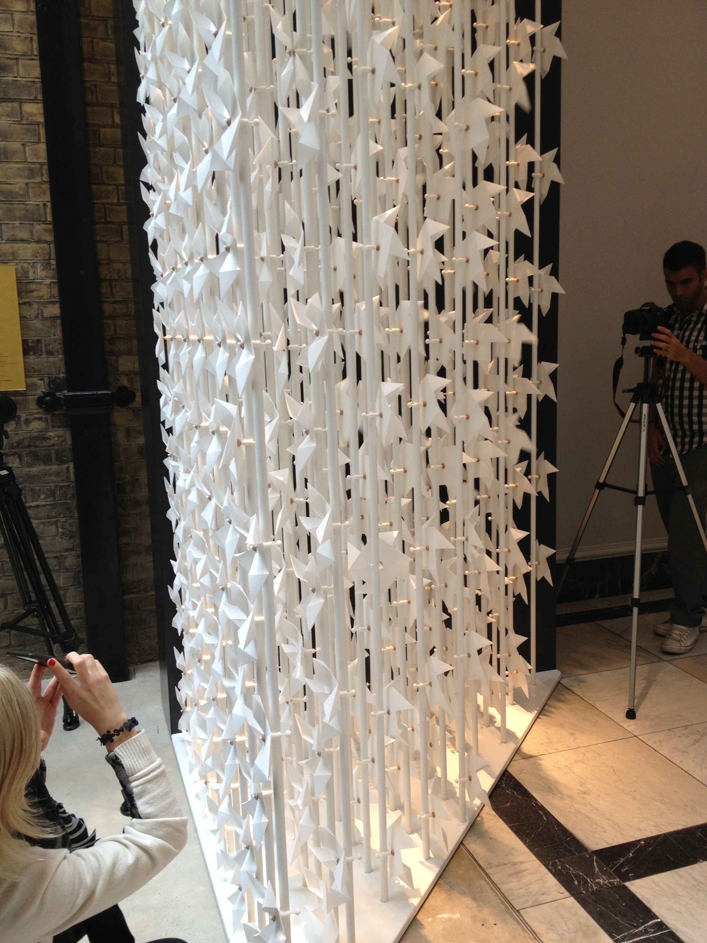
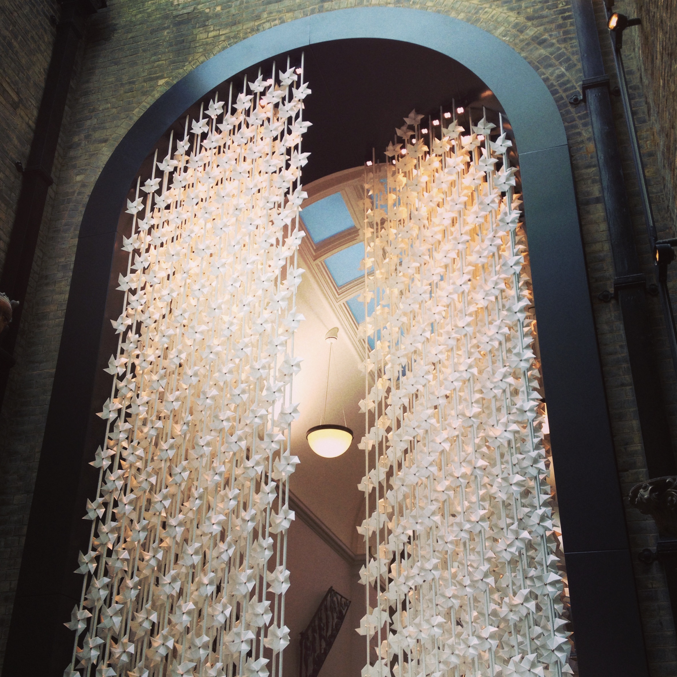
The wind portal by Najla El Zein
One of the most impressive of the installations, Lebanese designer Najla El Zein has created a gateway of 5,000 handmade paper windmills. They represent a transition between inside and outside; she said: “I really wanted the visitor to be able to experience it, to be able to touch it and see it”.
The Bodleian Chair competition
Over the past two months, six designer-manufacturer partnerships have developed designs for a new chair for Sir Giles Gilbert Scott’s Bodleian Libraries at the University of Oxford.
Responding to a brief including comfort, usability, practicality, longevity and character, the designs have now been shortlisted to three full-scale prototypes, which are on display at the architecture landing of the V&A juxtaposed with Bodleian chairs from 1756. The shortlisted partnerships are Amanda Levete Architects and Herman Miller, Barber & Osgerby and Isokon Plus and Matthew Hilton and SCP Ltd.
A final judging session will select the winning chair during the Festival, which will then be used in the newly refurbished Weston Library in autumn 2014.
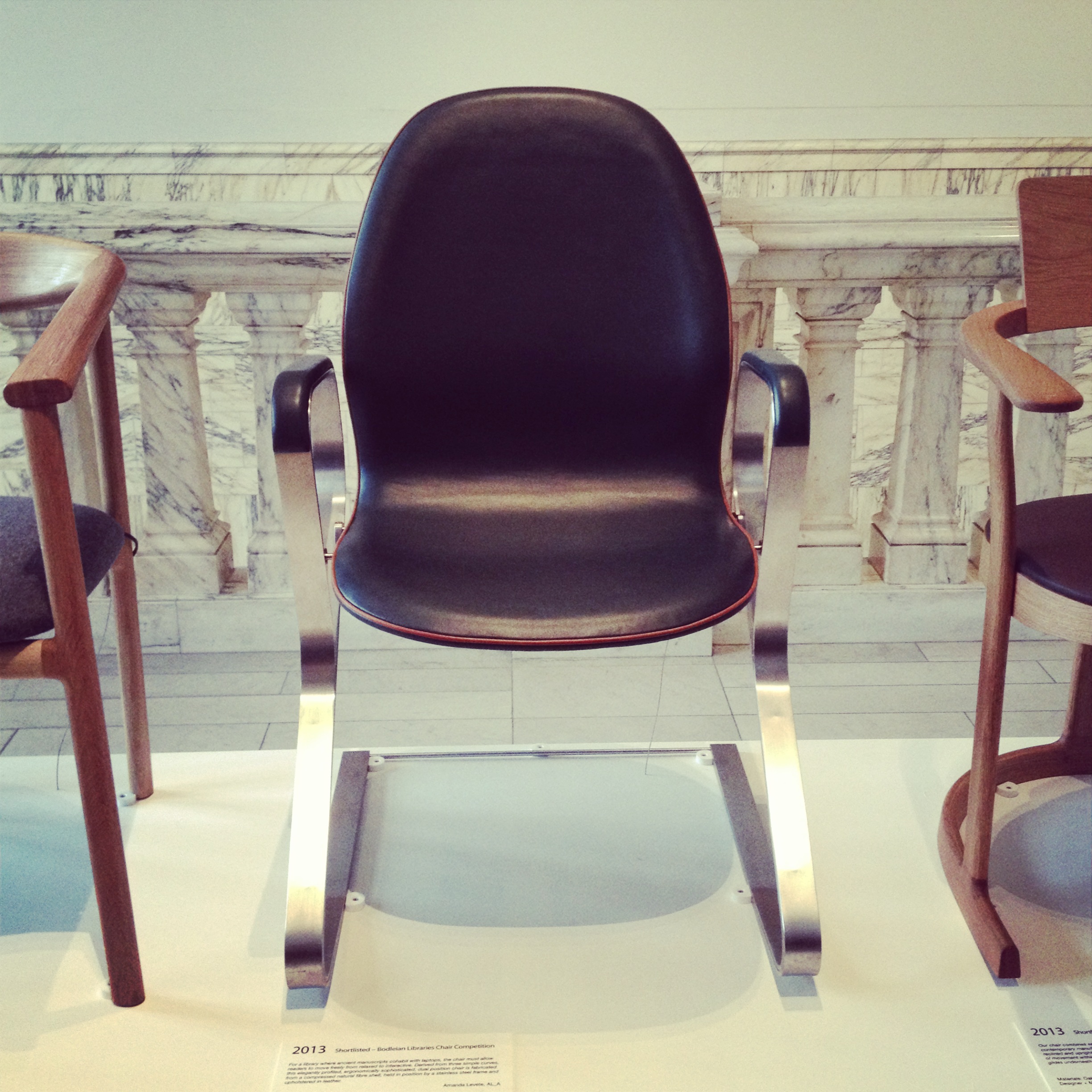
Amanda Levete’s chair
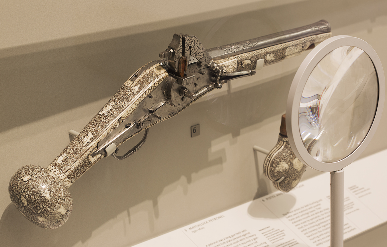
God is in the details
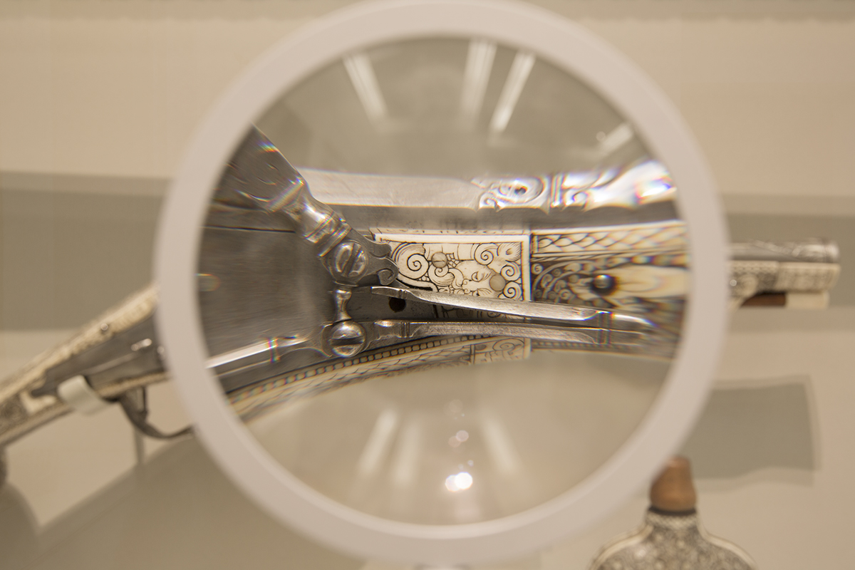
14 designers have selected an object from the V&A’s extensive collection, which is highlighted with a magnifying glass constructed from Swarovski specialist lenses. God is in the details invites visitors to take a moment and really look at an object, something we rarely do in a world of smartphones and digital cameras.
‘Bums on seats’ by Ally Capellino
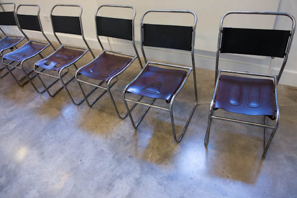
Accessories designer Ally Capellino has transformed the modernist tubular stacking chair using materials and techniques from her signature leather bags.


