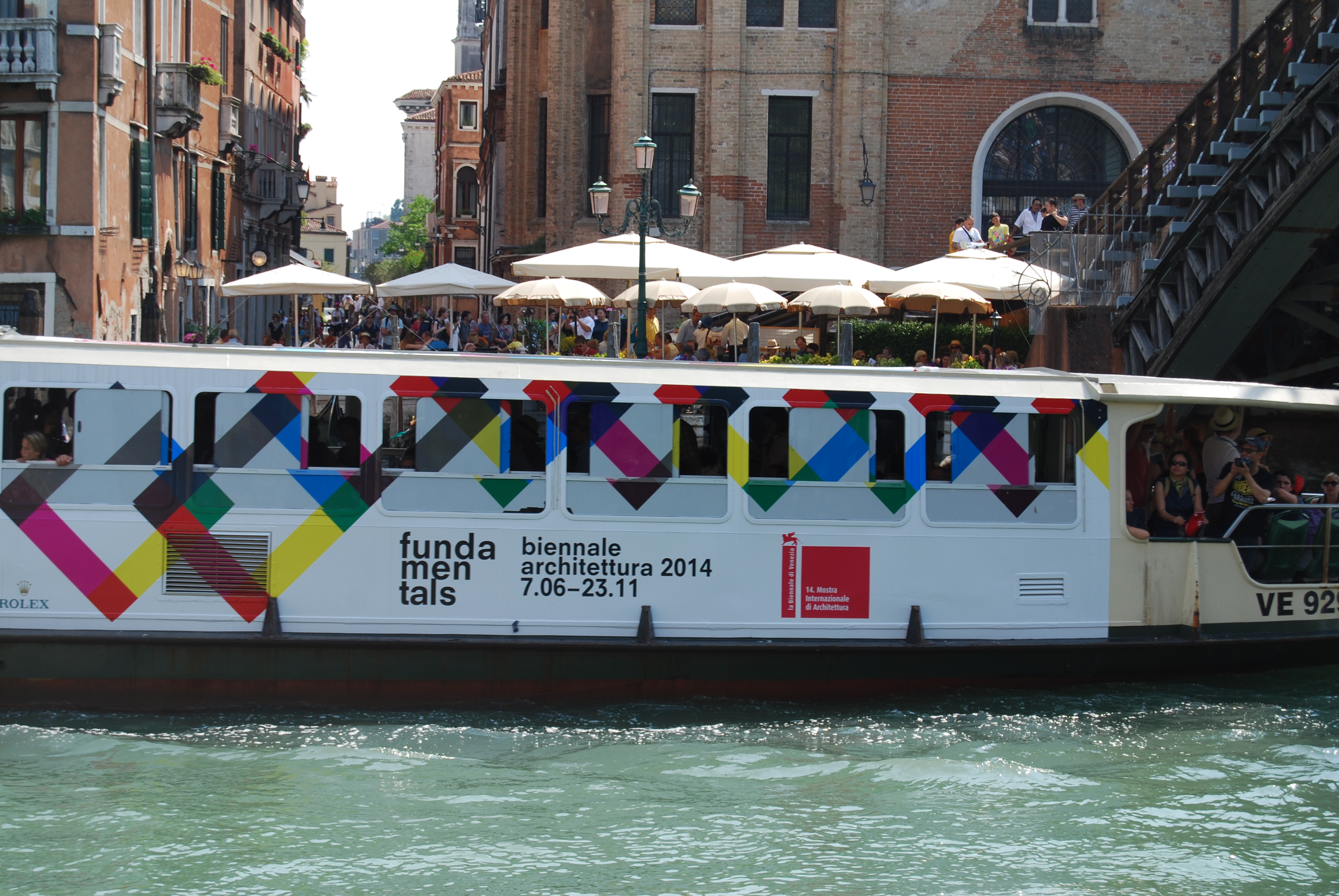
This year the Architecture Biennale in Venice was bigger and better. There just seemed like there was so much more to see this time round, perhaps because there was a 10 new countries exhibiting and lots more collateral events across the city. The theme of Absorbing Modernity also appealed to my architectural historian self, with lots of pavilions dwelling on the nostalgia of the past. The Biennale is also six months longer this time, to match its sister, the Art Biennale, so there’s still plenty of time to hop over and see it.
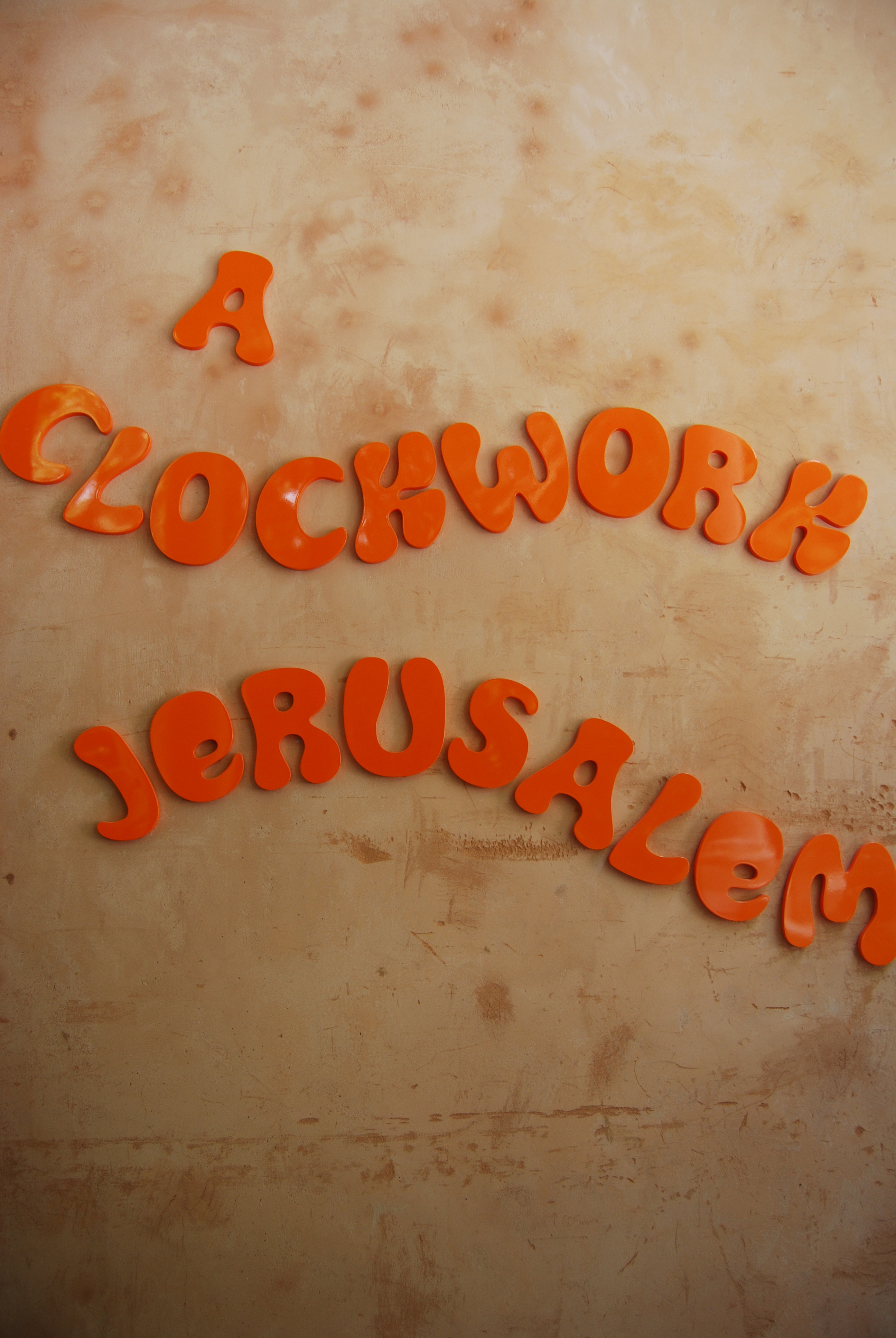
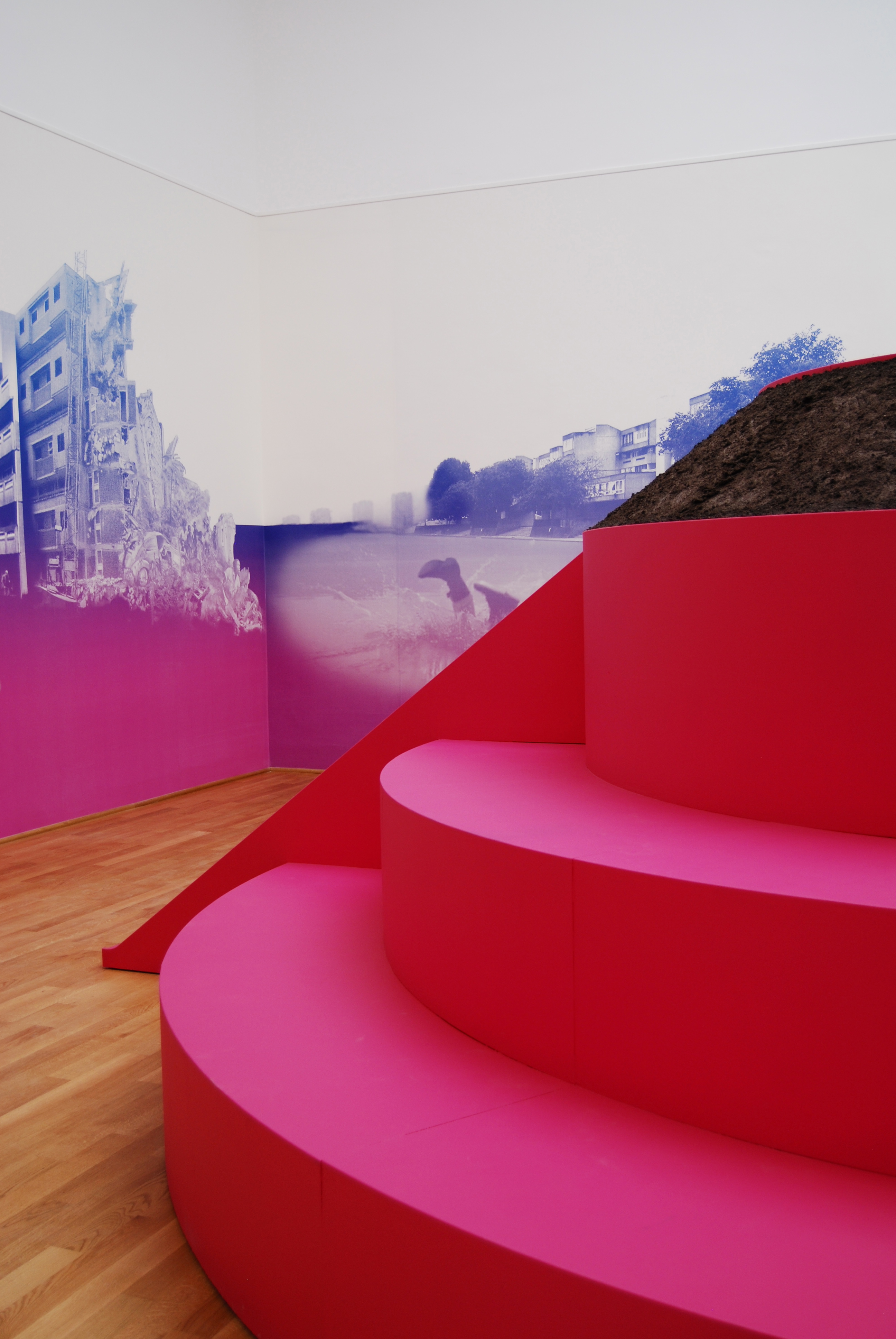
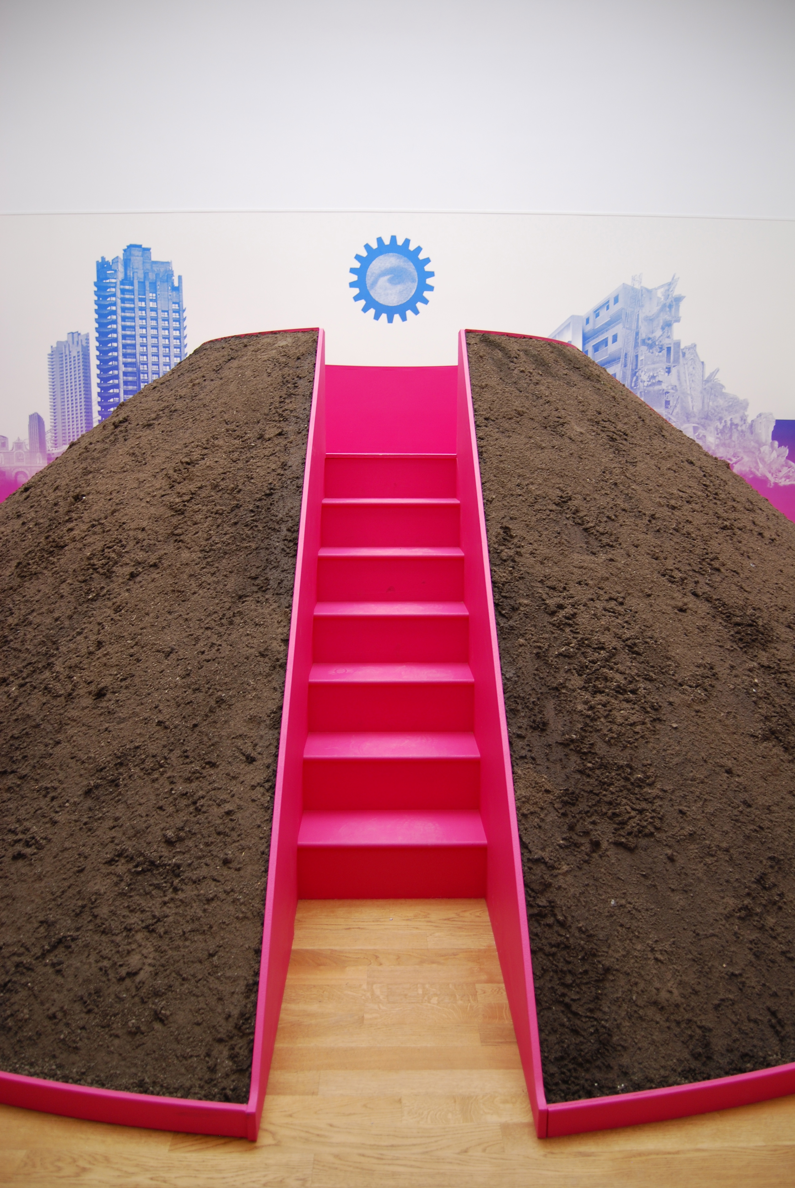
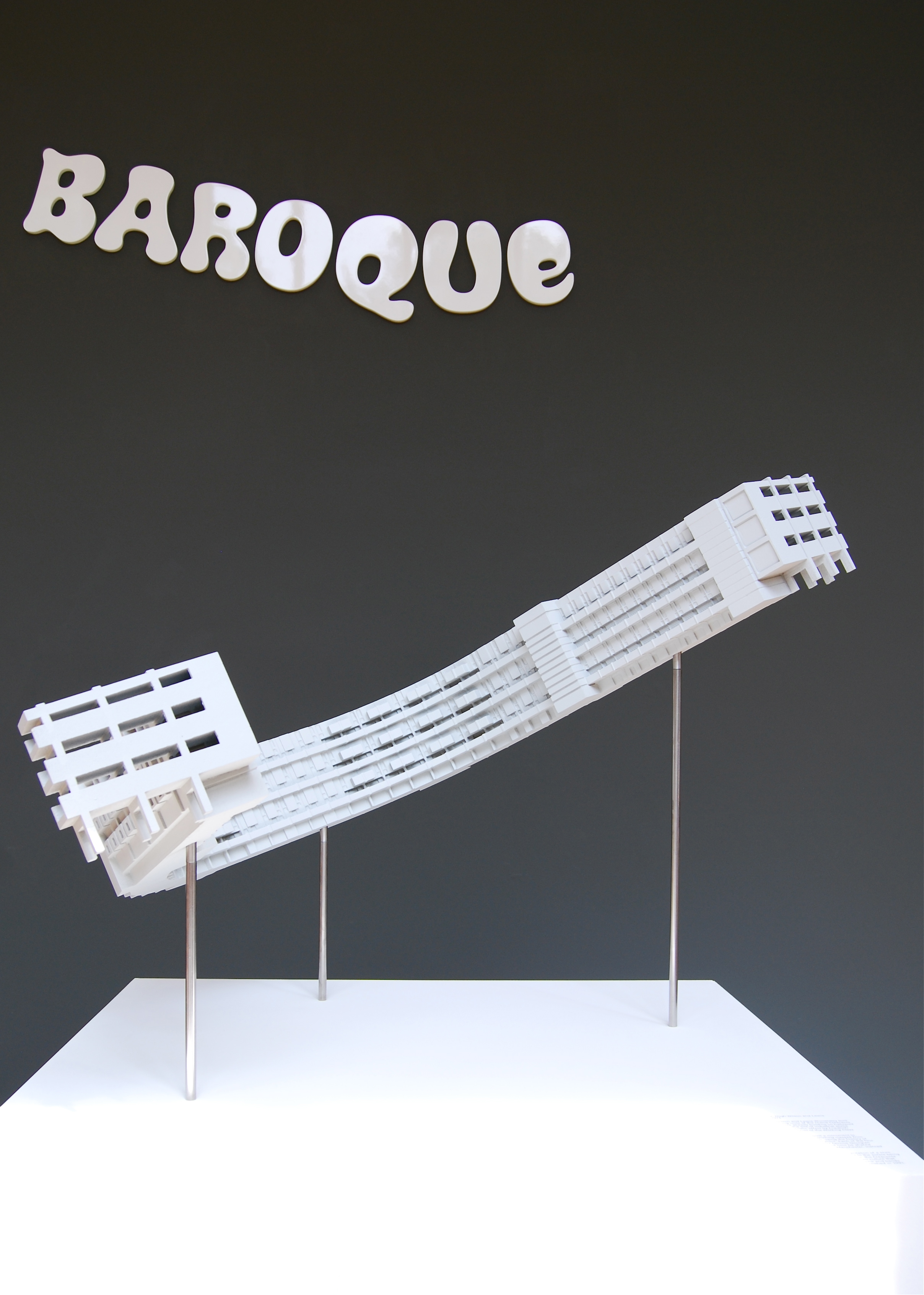
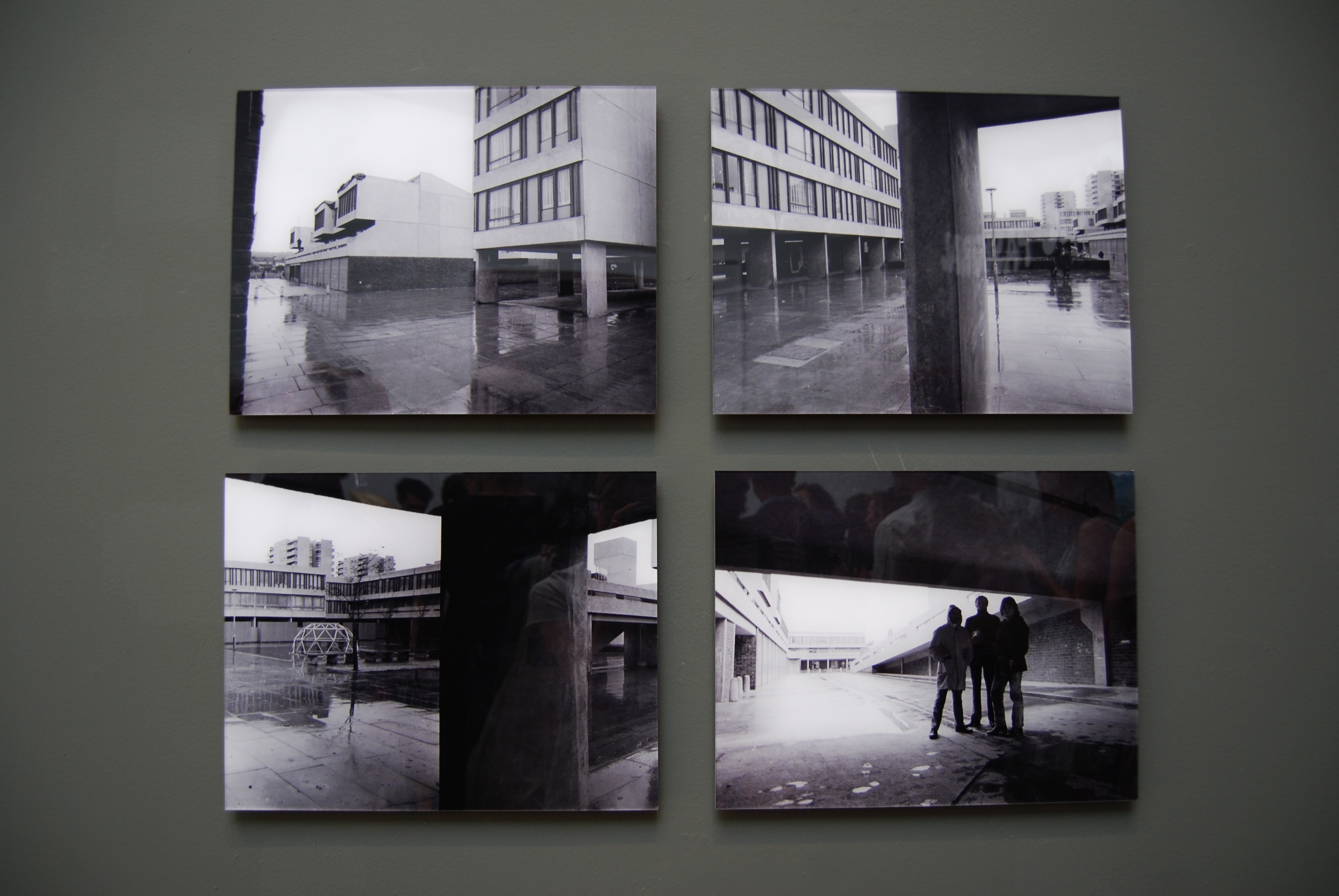
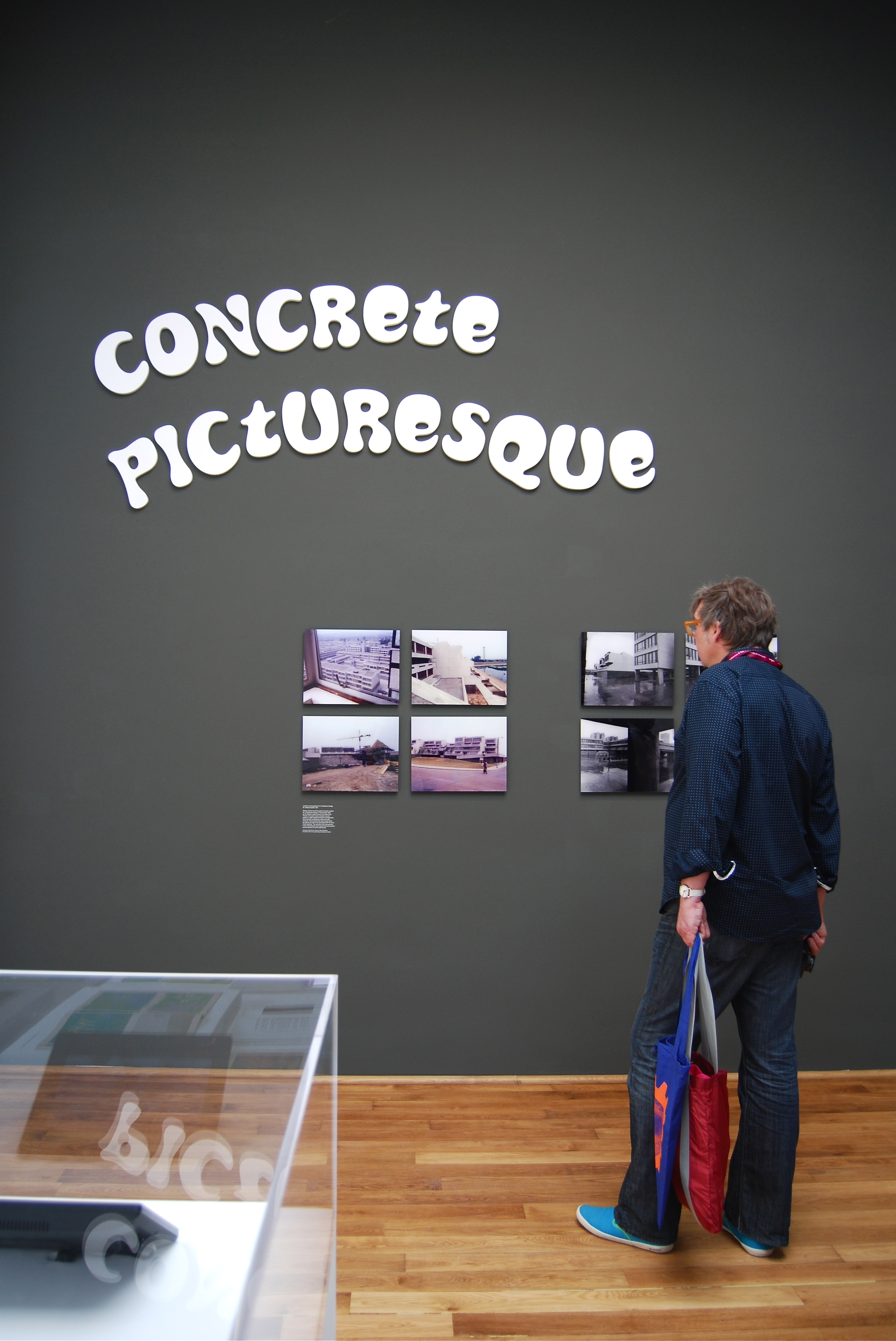
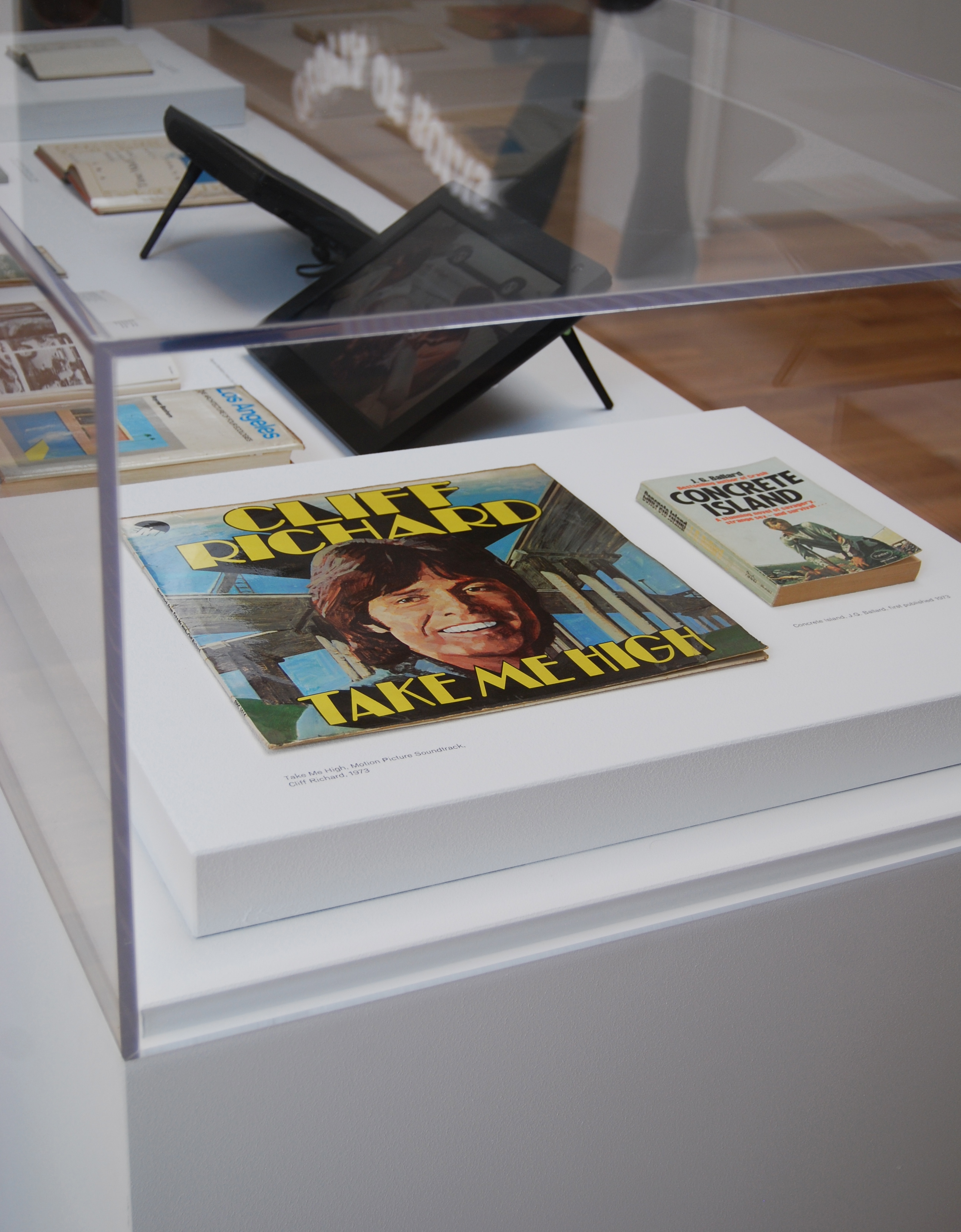
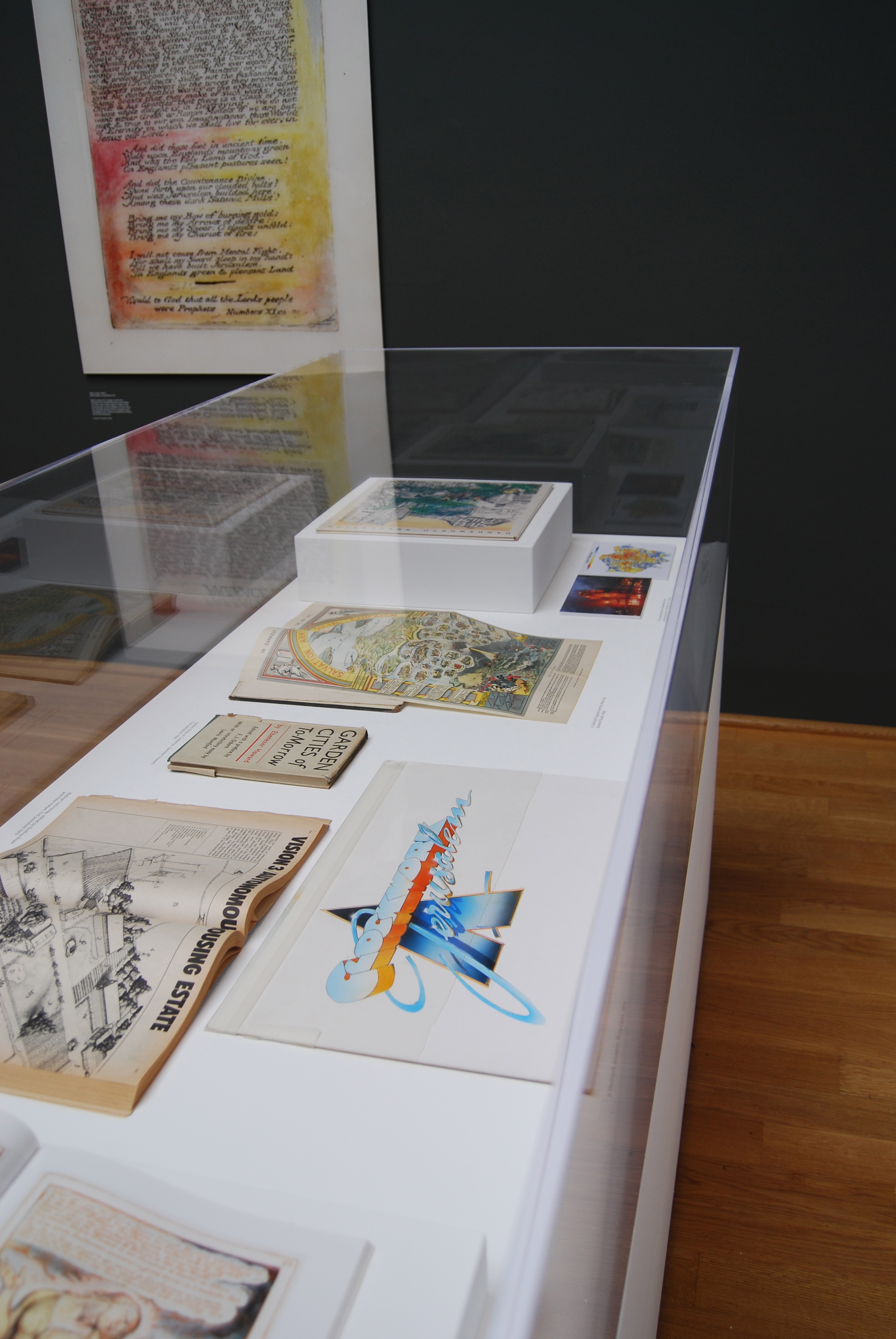
This time round I was lucky to be involved in the research for the British Pavilion with FAT architecture and Crimson Architectural Historians, it was great to see all the work in-situ, including two concrete cows shipped over from Milton Keynes, photographs of Joy Division by Kevin Cummins and sketches of the Barbican in London. Other highlights included the Central Pavilion, where curator Rem Koolhaas and students from Harvard School of Design broke down a building into 13 essential parts, from the standard bog to roofs and ramps. I loved that it was accessible to everyone and didn’t focus on the ‘starchitects’ of today. Elsewhere there was the Belgium and German pavilion, which were both kept simple and easy to read, while Scandinavia looked to its architectural influence in Africa and France to Jacques Tati’s films and Jean Prouve’s prefabs. Below is a short selection of what’s worth seeing.
To find out more visitor information including tickets and opening times, click here. (Also keep an eye out for Blueprint’s July/August issue, out at the beginning of July, which will have full coverage of the Biennale).
1. Elements of Architecture, Central Pavilion
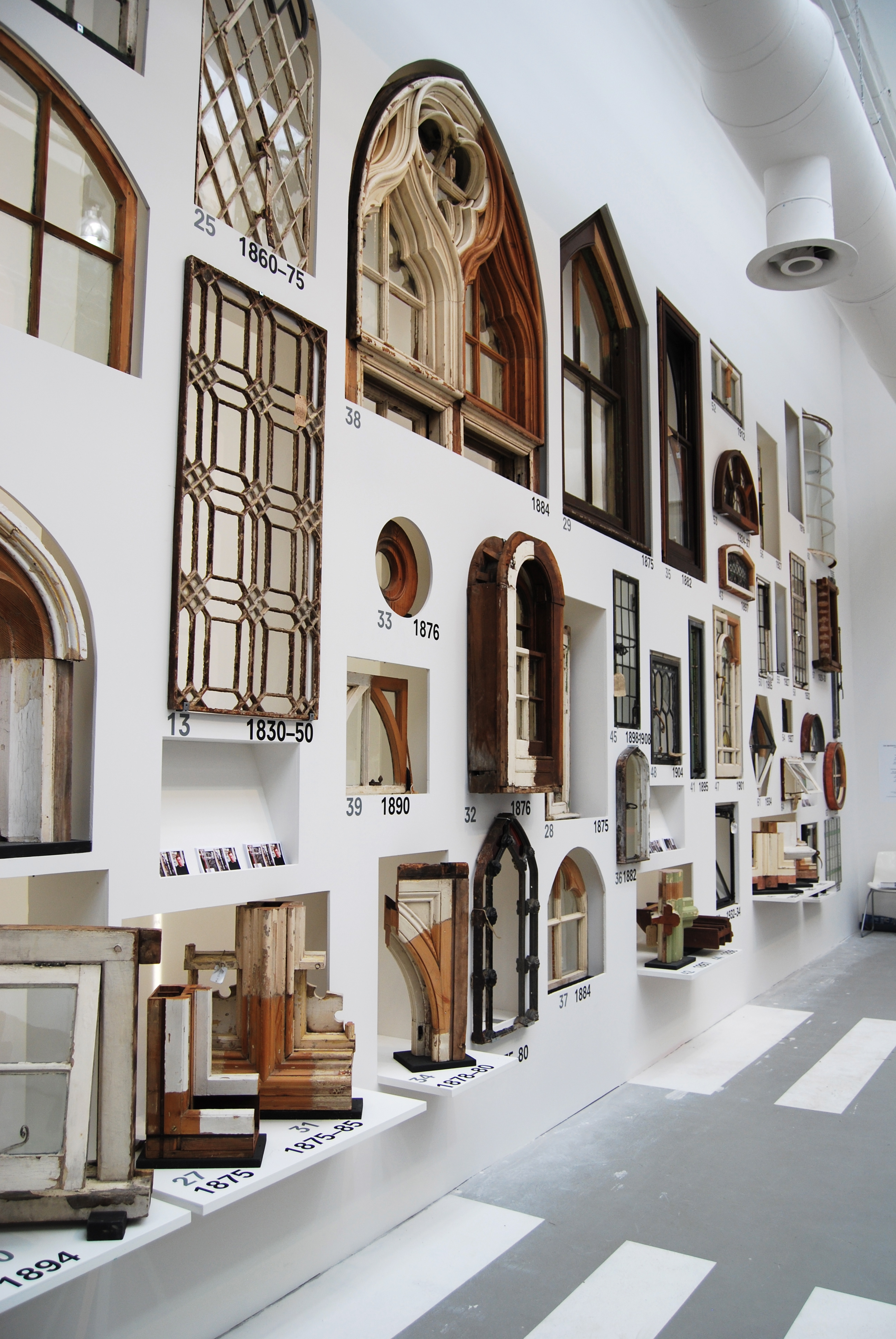
Each room in the Central Pavilion in the Giardini was dedicated to a different architectural element. My favourite was the window room, which showcased Charles Brooking’s vast collection of English windows from great country estates to Royal Palaces (there was even a window from the street where I grew up, though of course it wasn’t from a royal palace!)
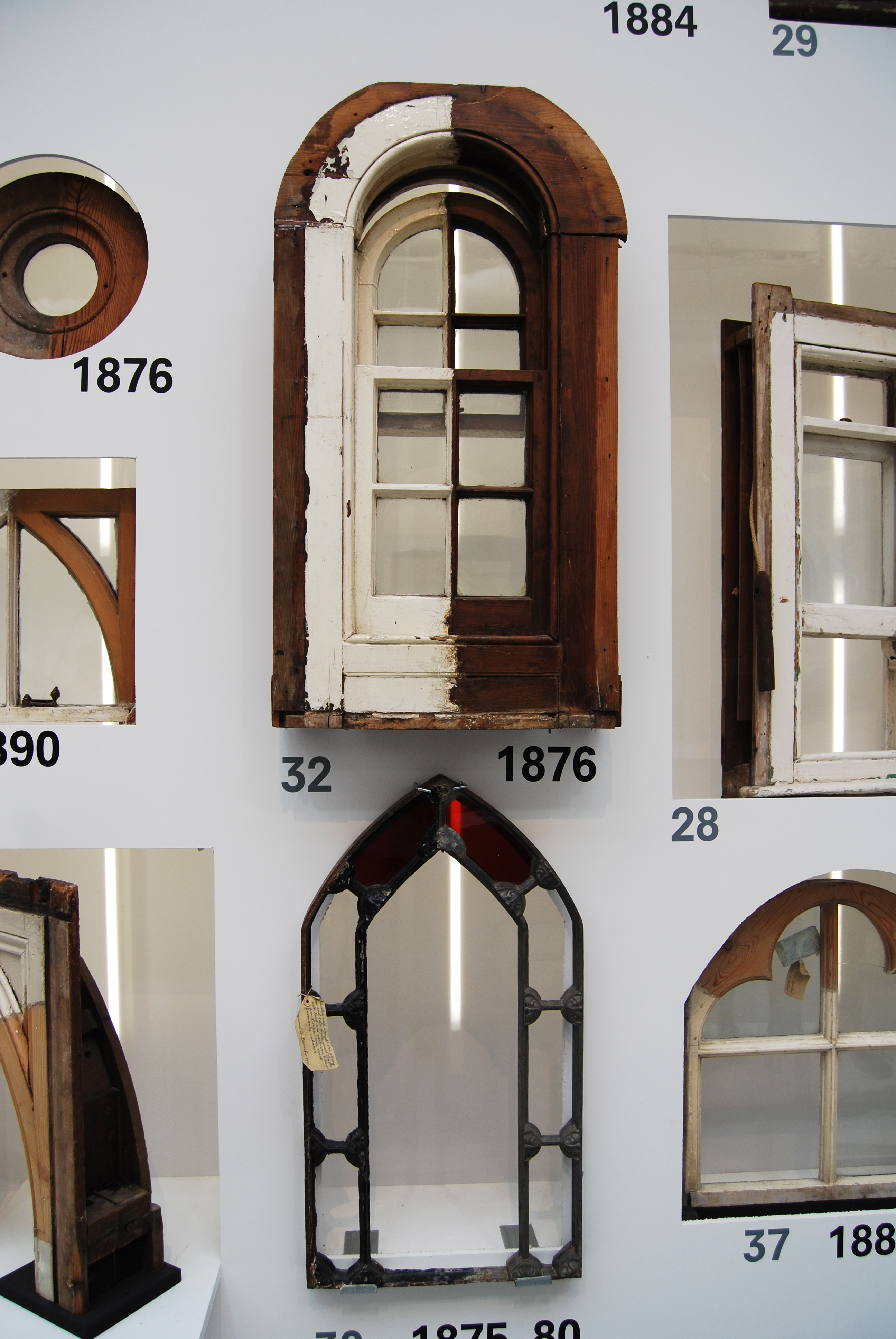
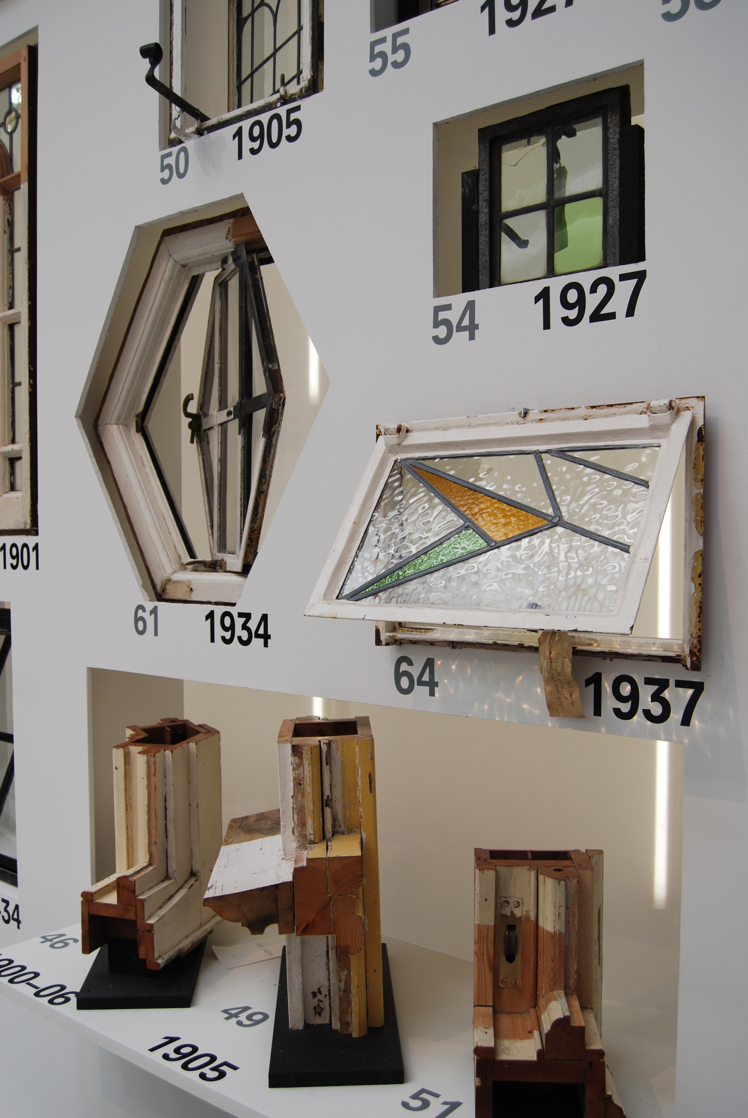
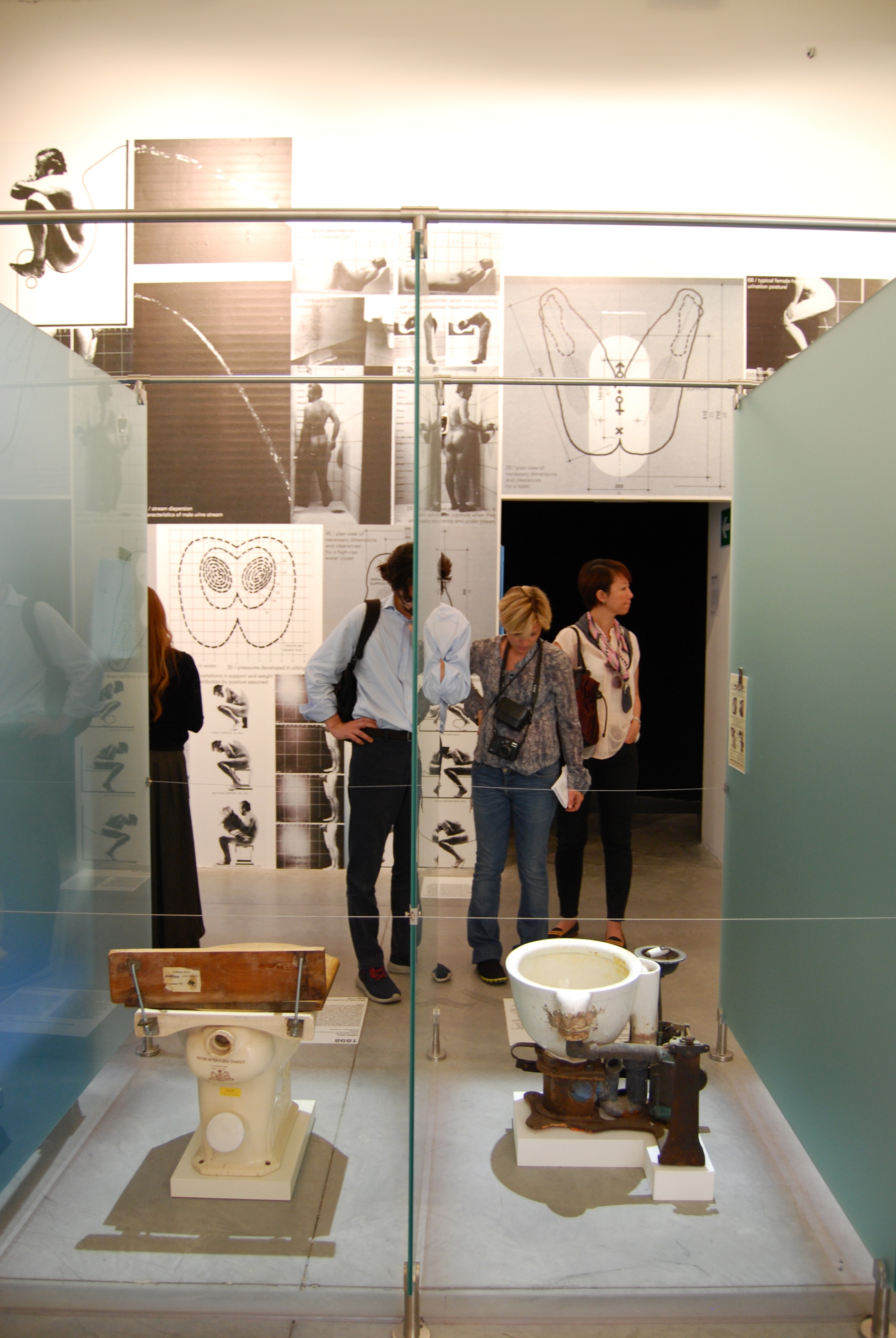
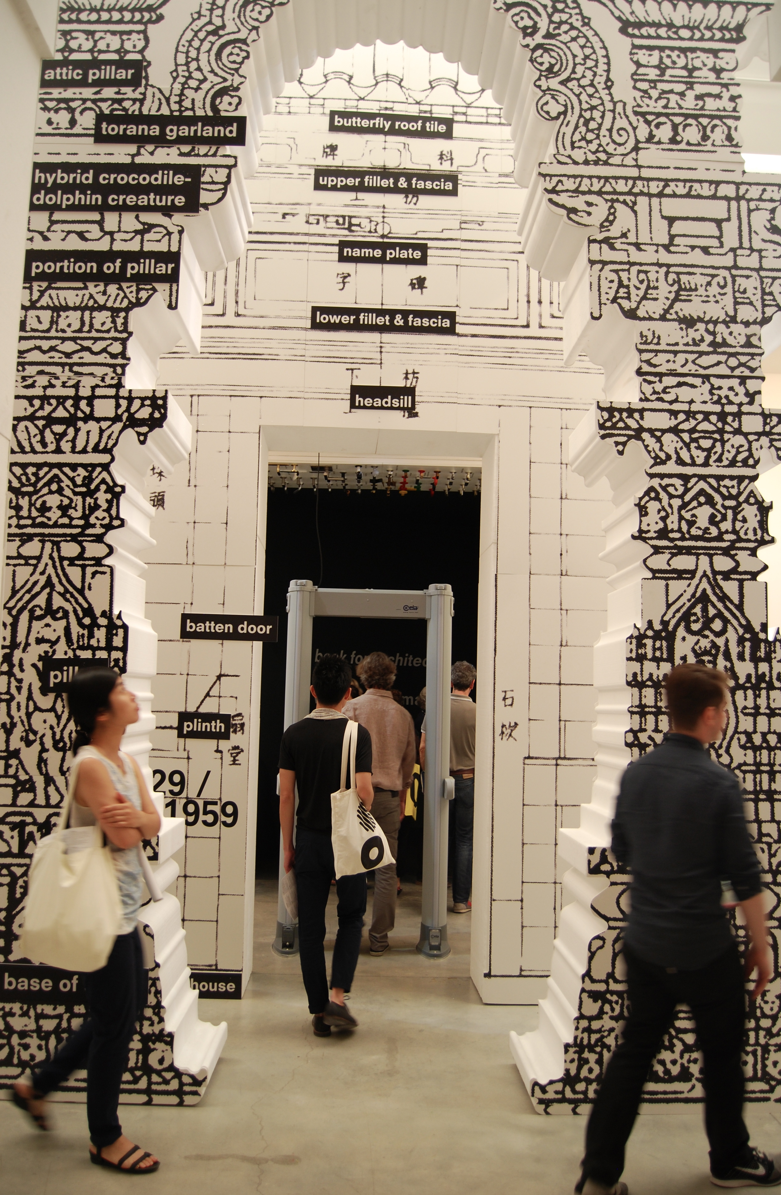
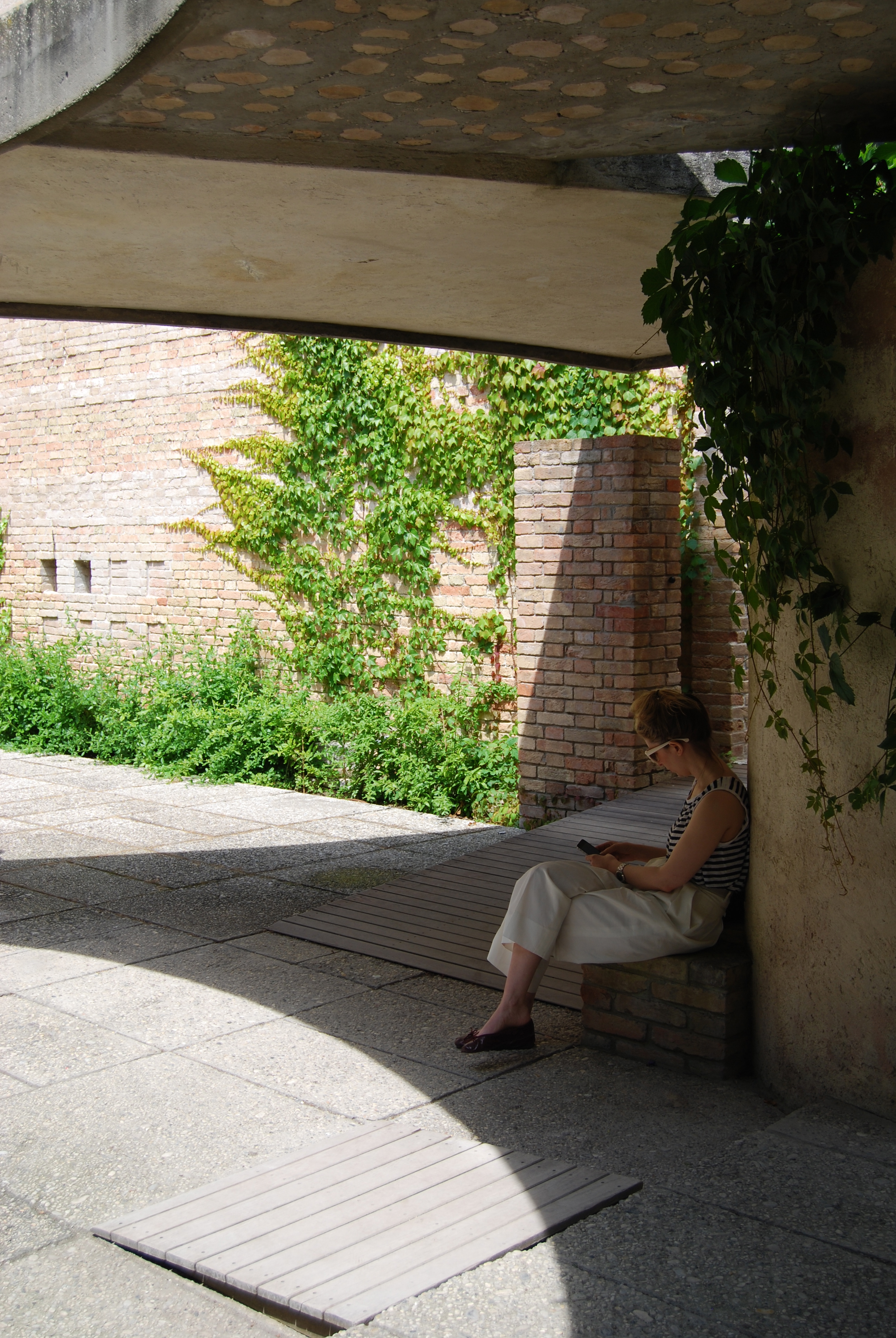
If you want a little break, Carlo Scarpa’s courtyard garden is perfect.
2. British Pavilion, Giardini
The British Pavilion explored the flowering of British modernism, sourcing influences from Stonehenge to council estates, from Ebenezer Howard to Cliff Richard, from ruins and destruction to rural fantasies.
3. Nordic Pavilion, Giardini
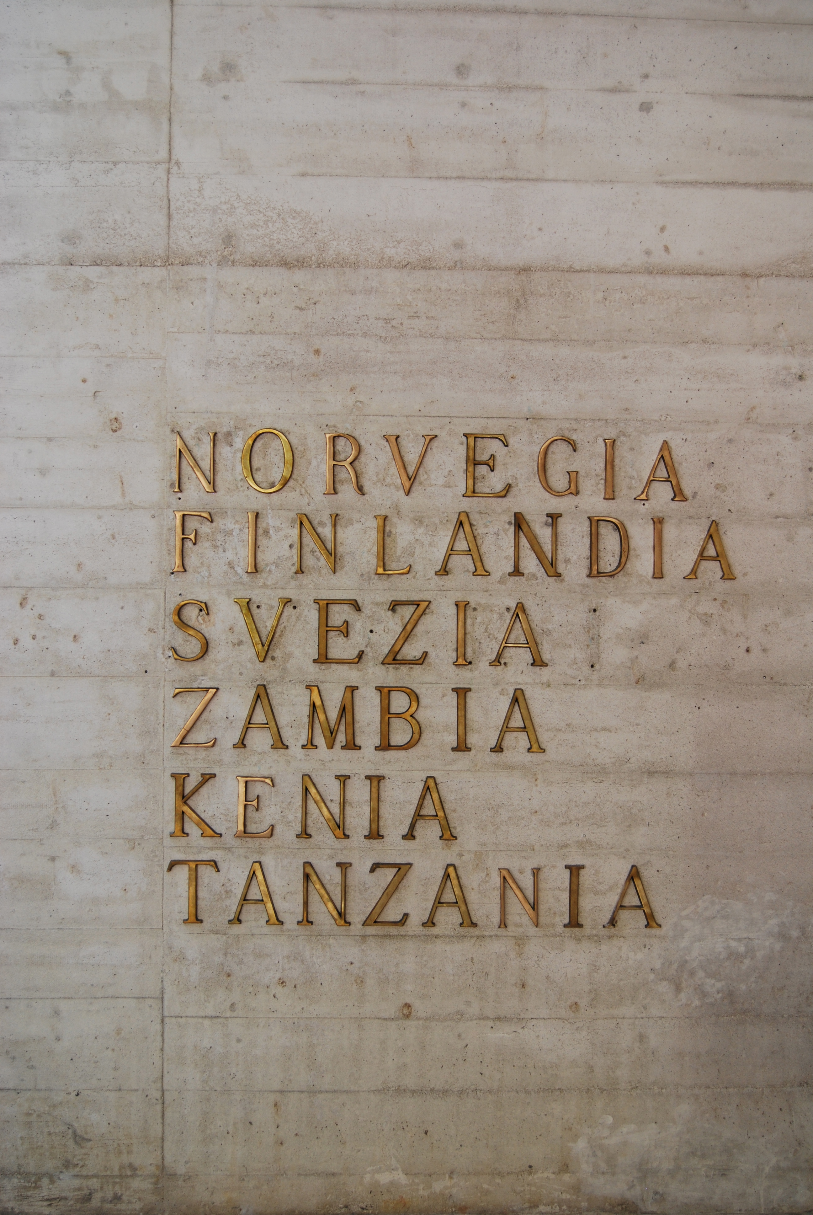
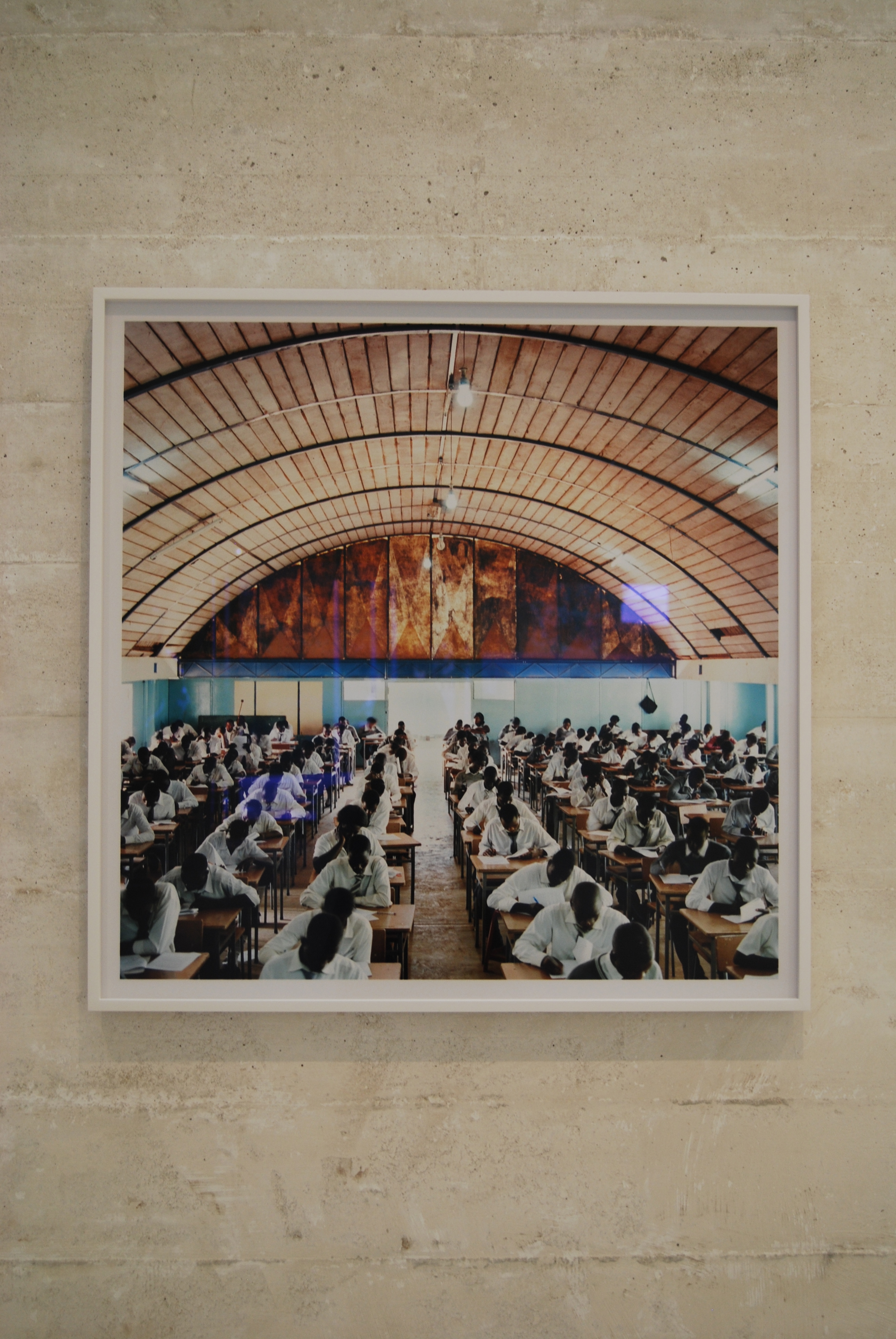
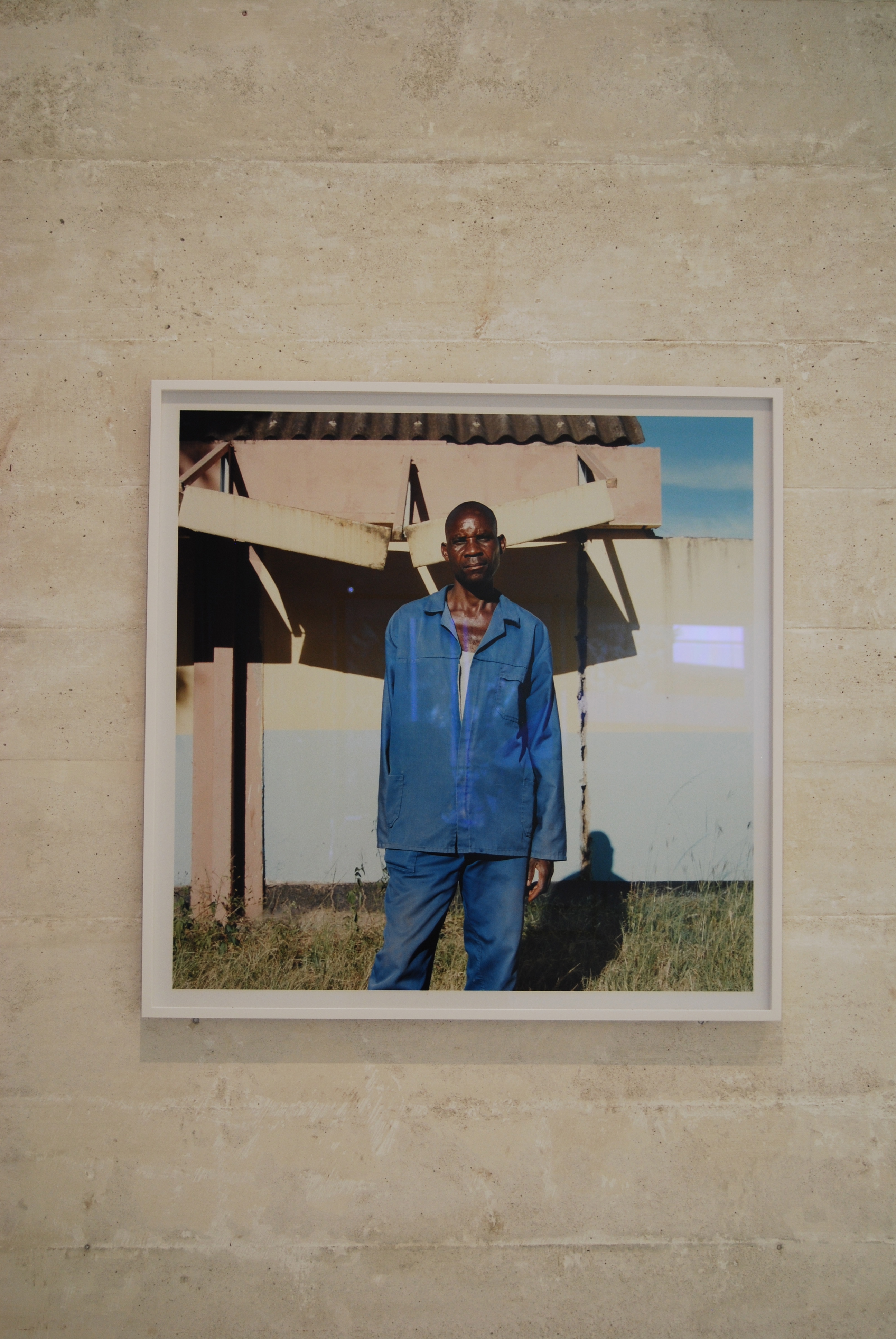
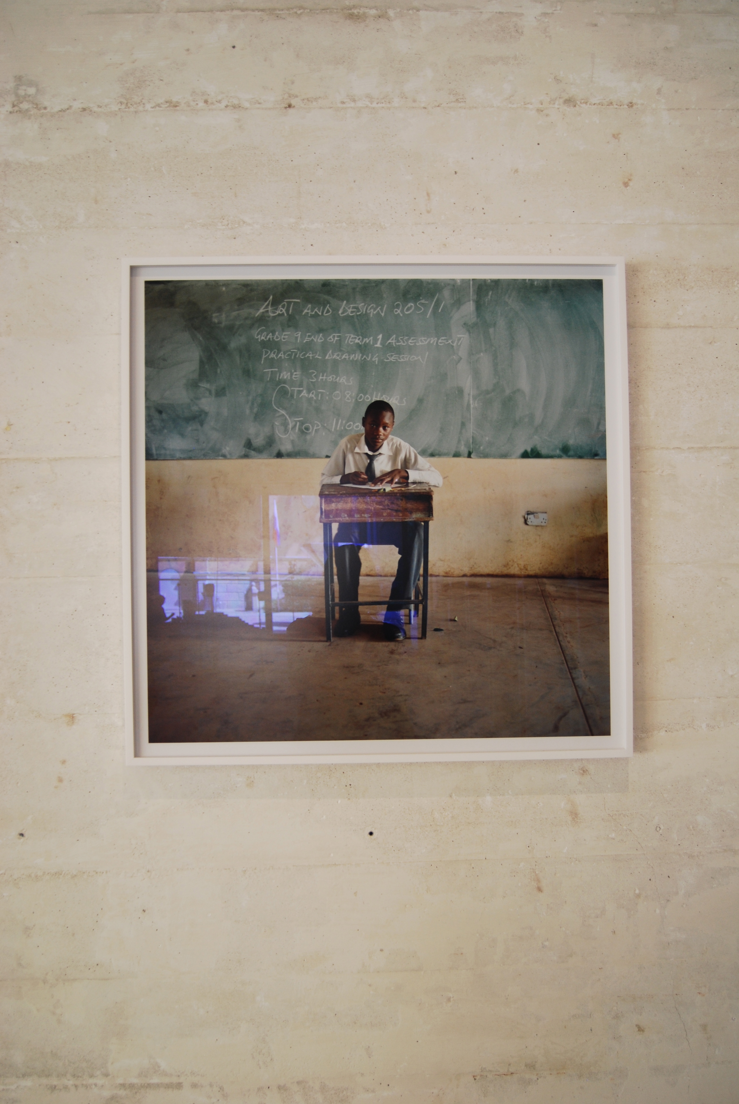
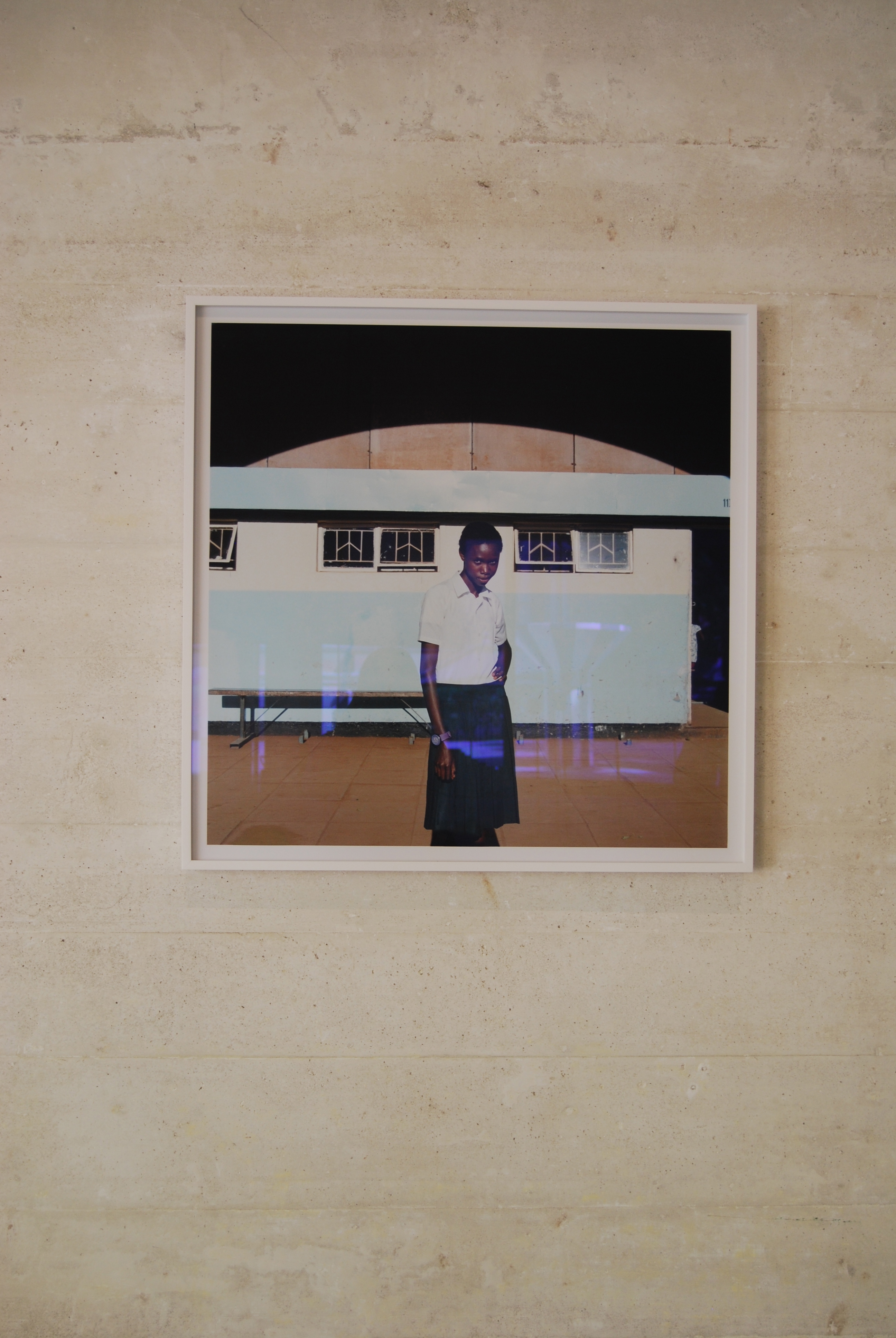
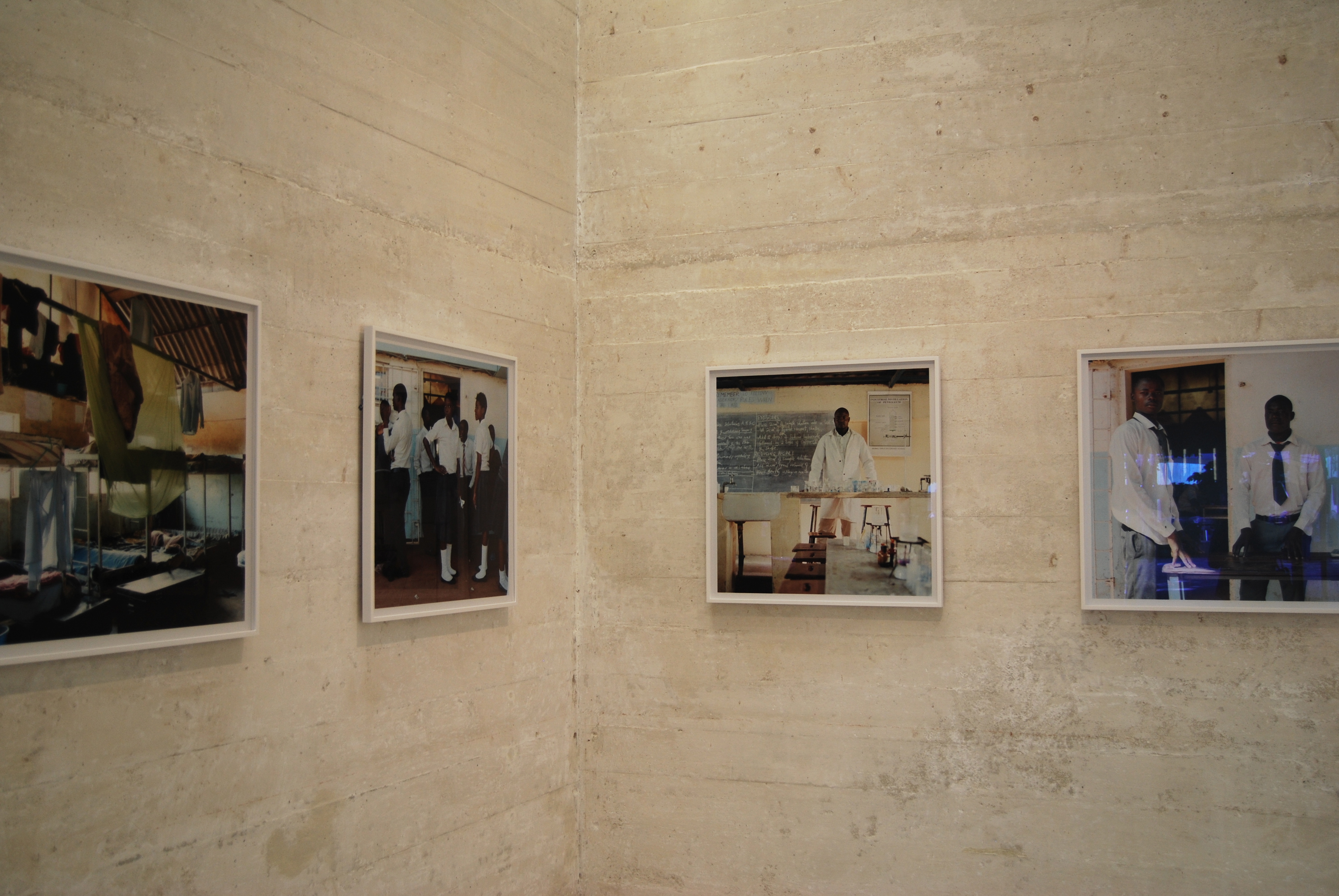
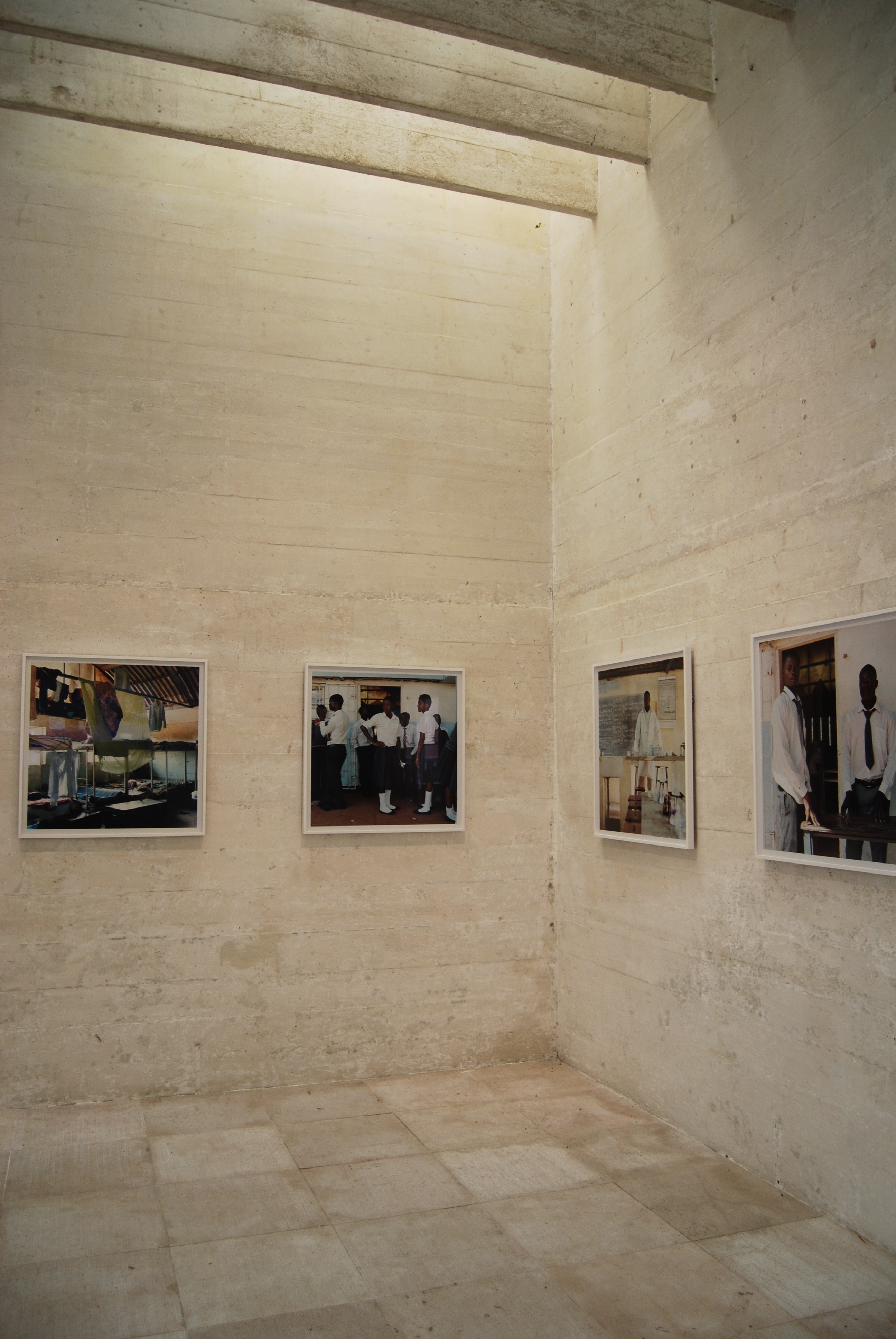
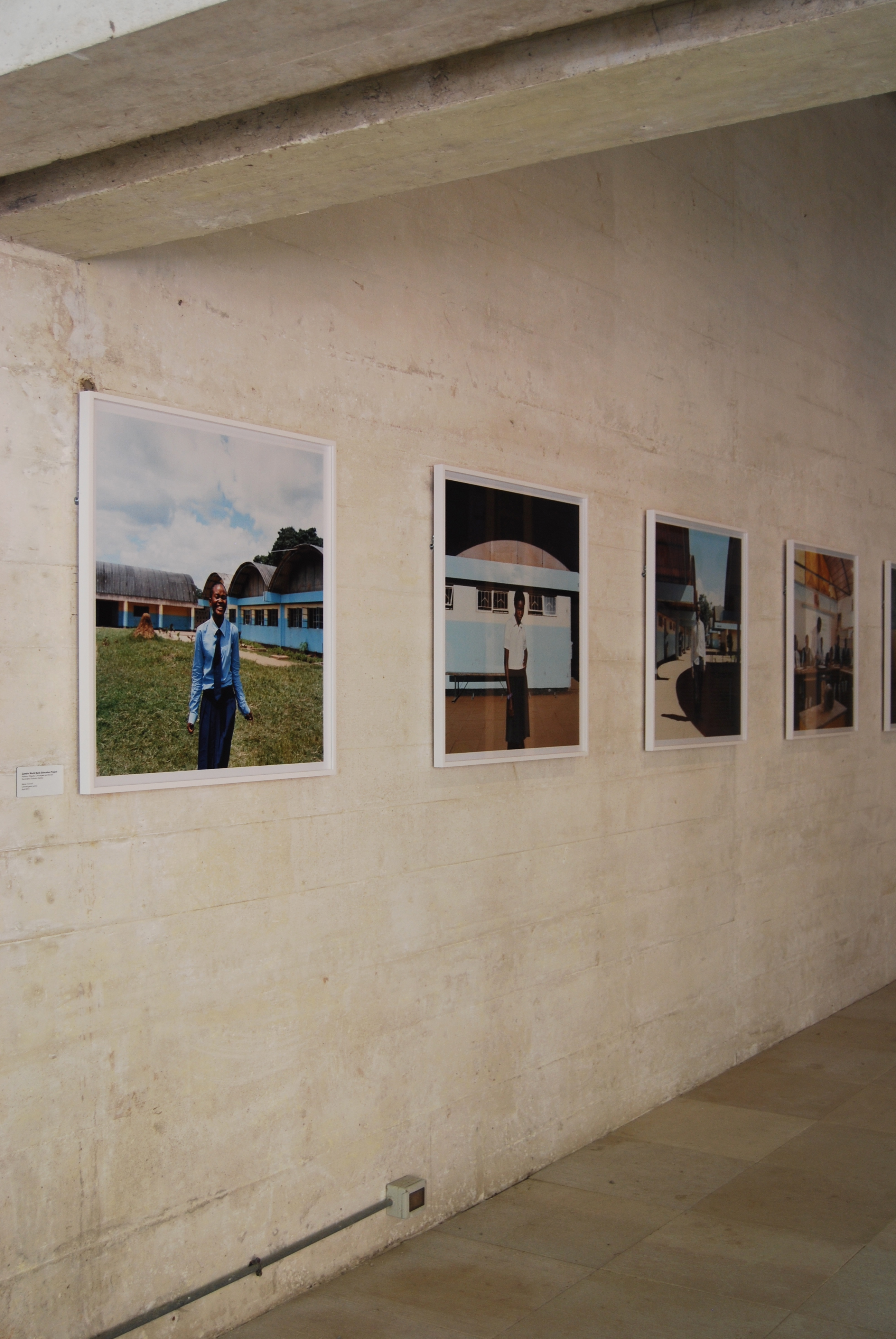
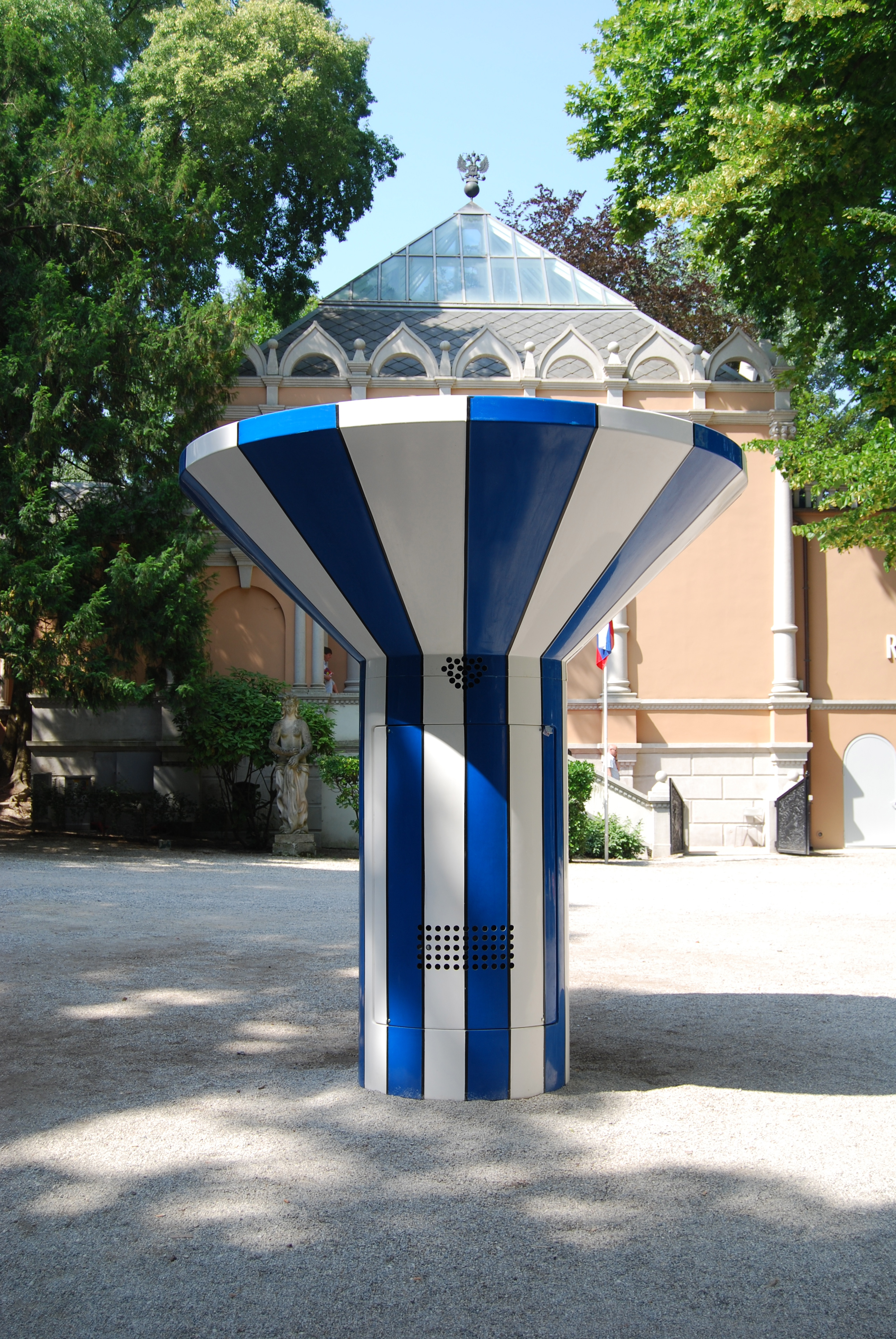
The Nordic pavilion examined its influence on post-war structures built in Africa. Highlights include photographs by Iwan Baan and Mette Tronvoll and a blue and white striped water fountain outside the pavilion. The building Sverre Fehn is worth a visit alone.
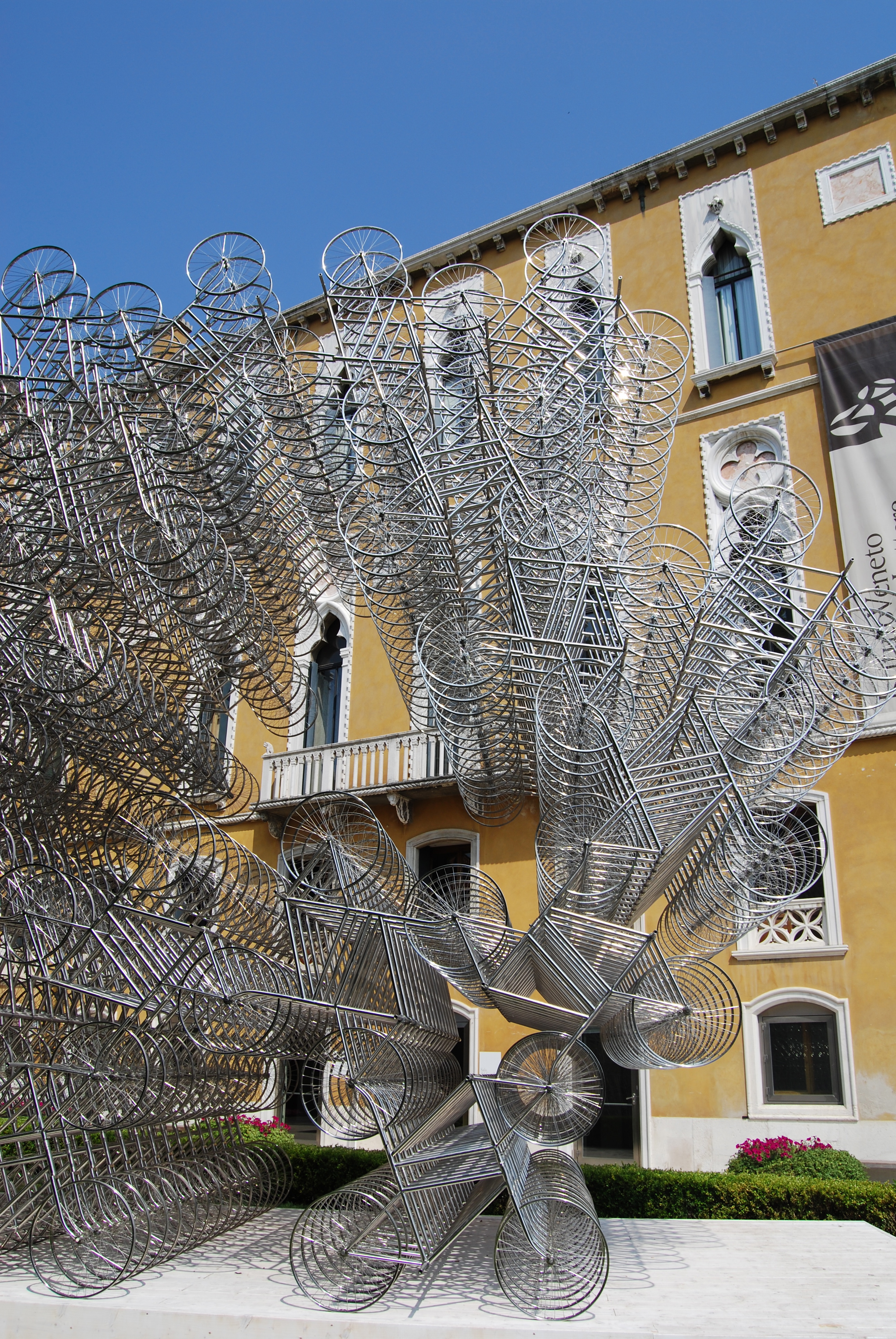
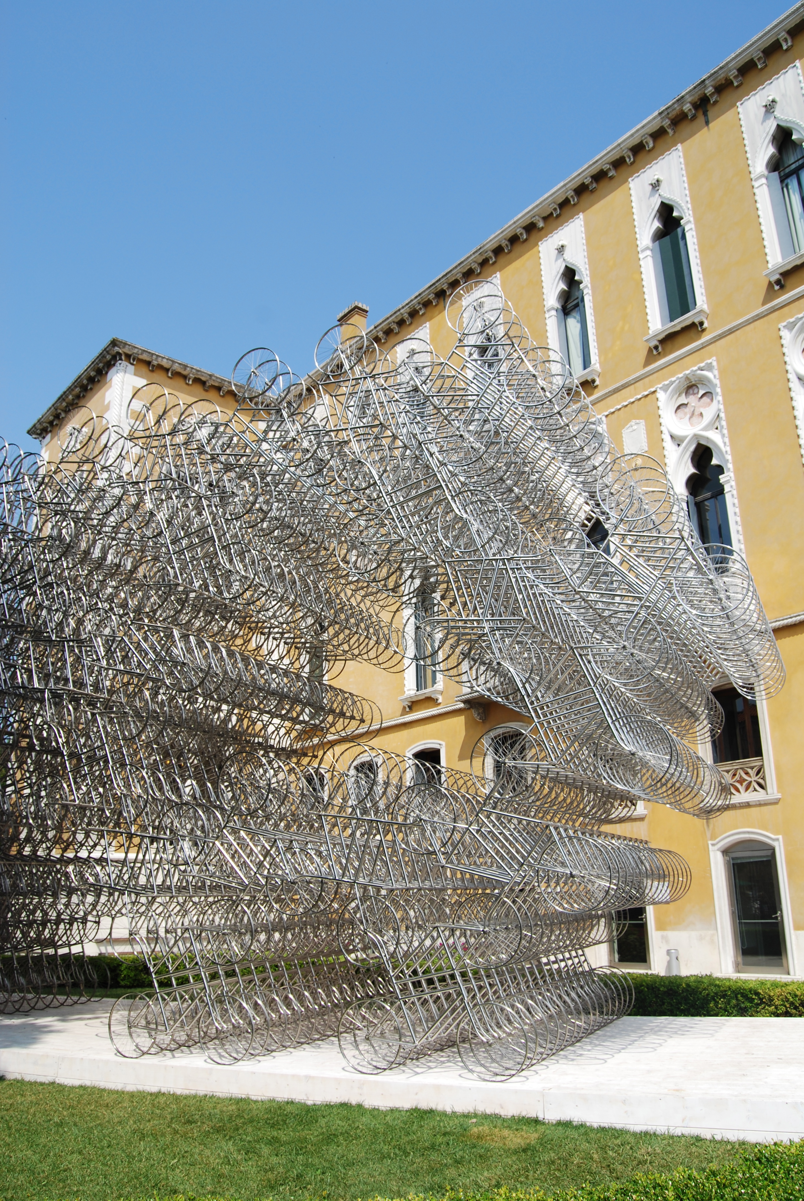
4. Genius Loci, Lisson Gallery
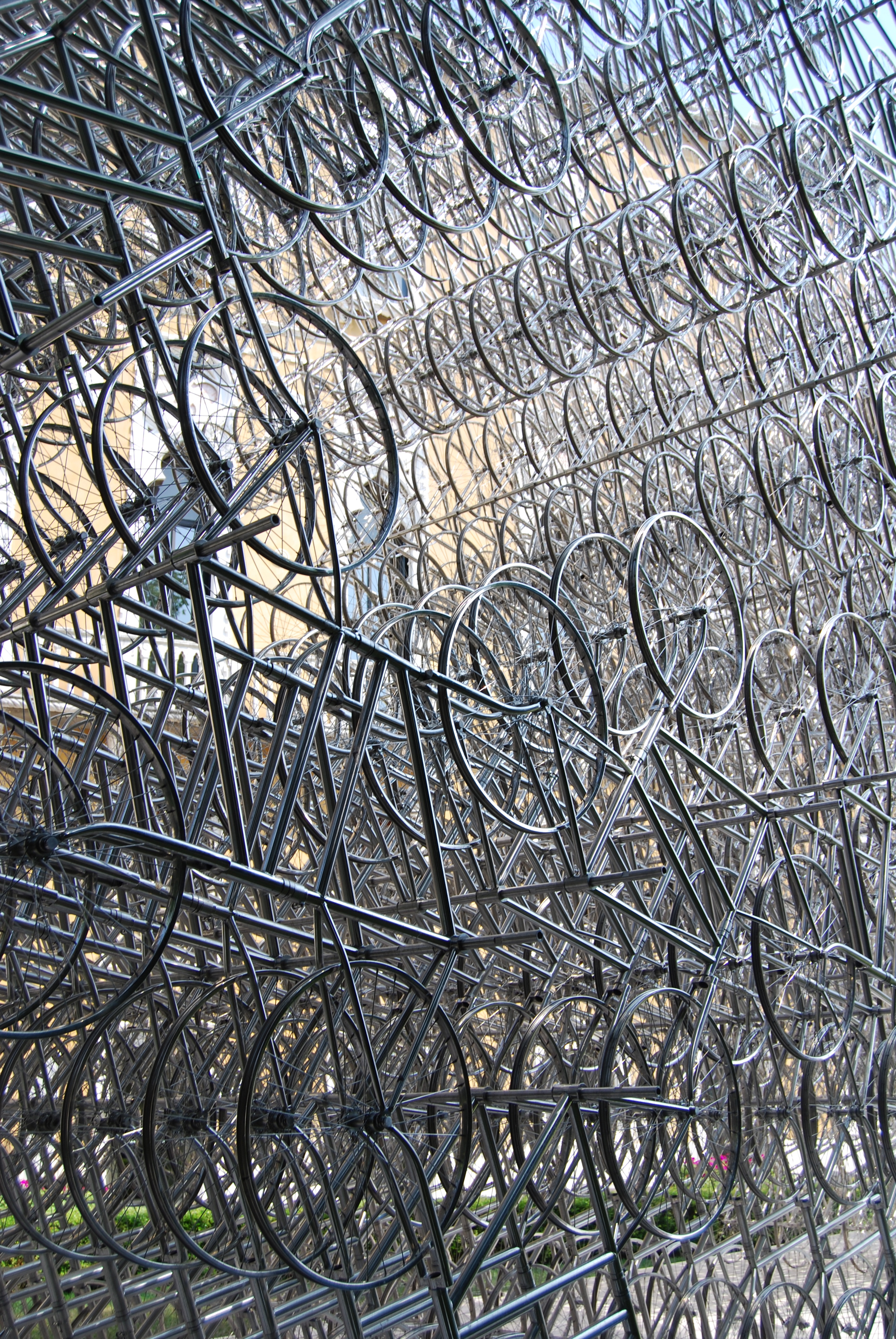
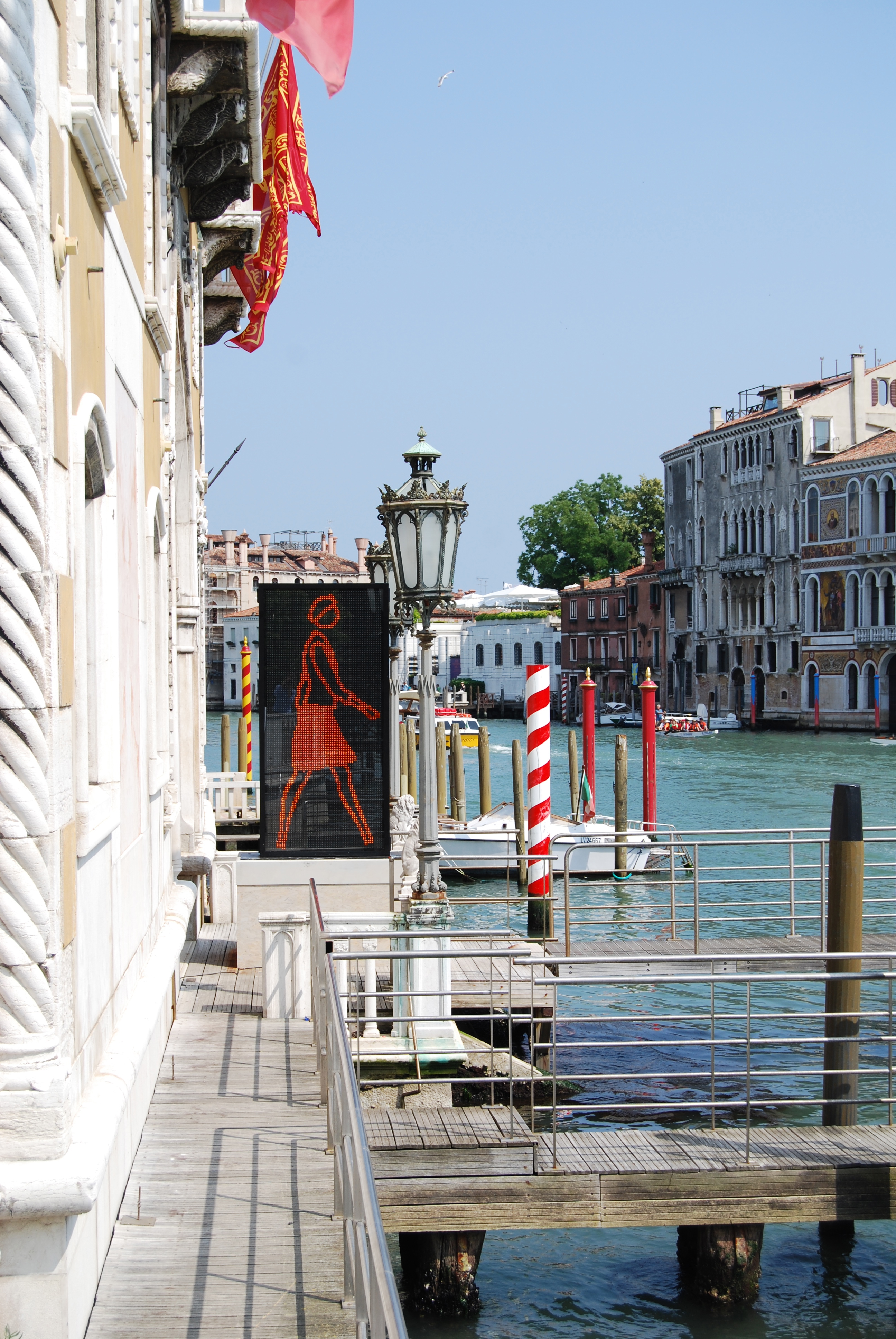
The Lisson Gallery presented an exhibition at a palazzo on the Grand Canal featuring work by Ai Weiwei, Richard Deacon and Julian Opie.
5. Belgium Pavilion, Giardini
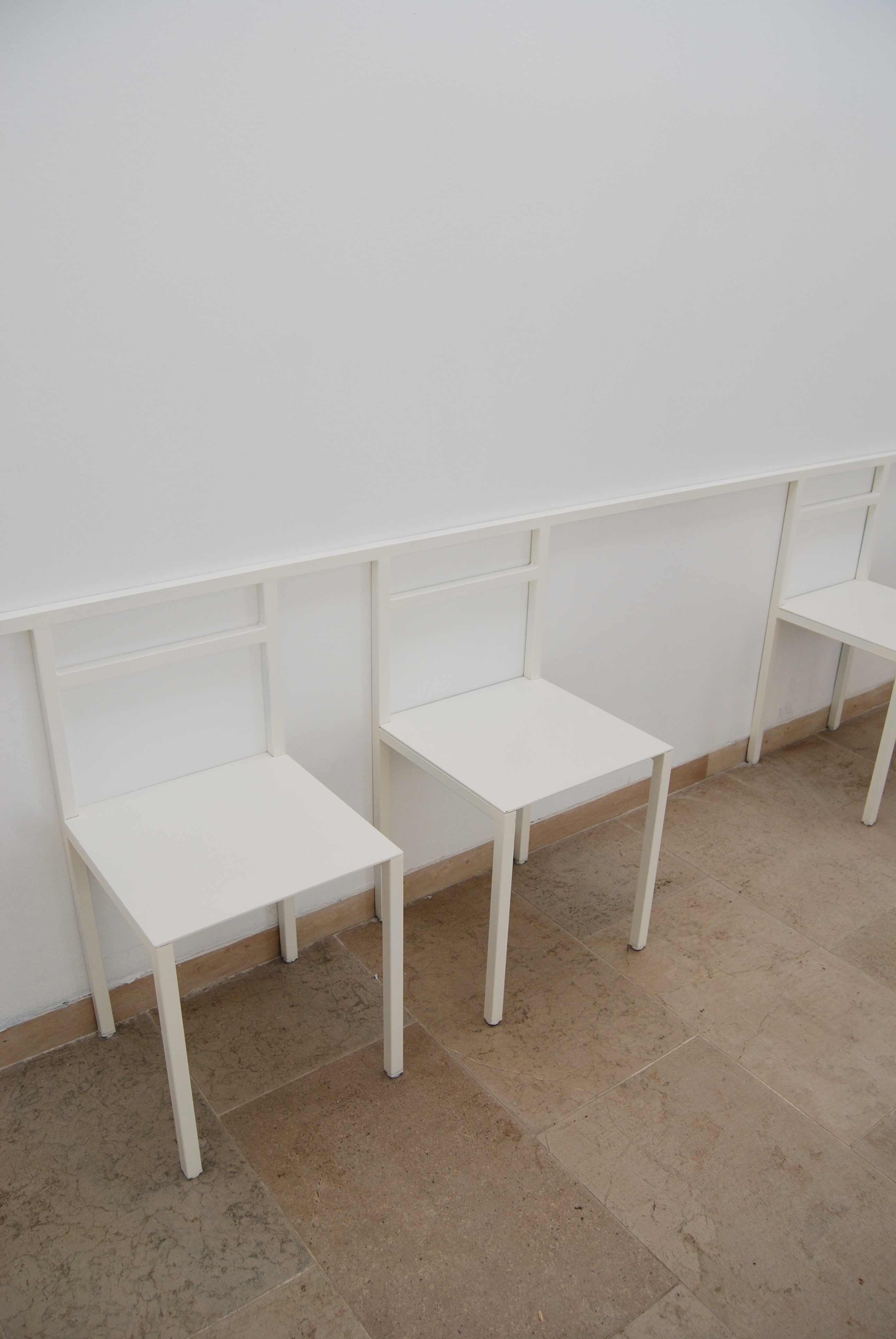
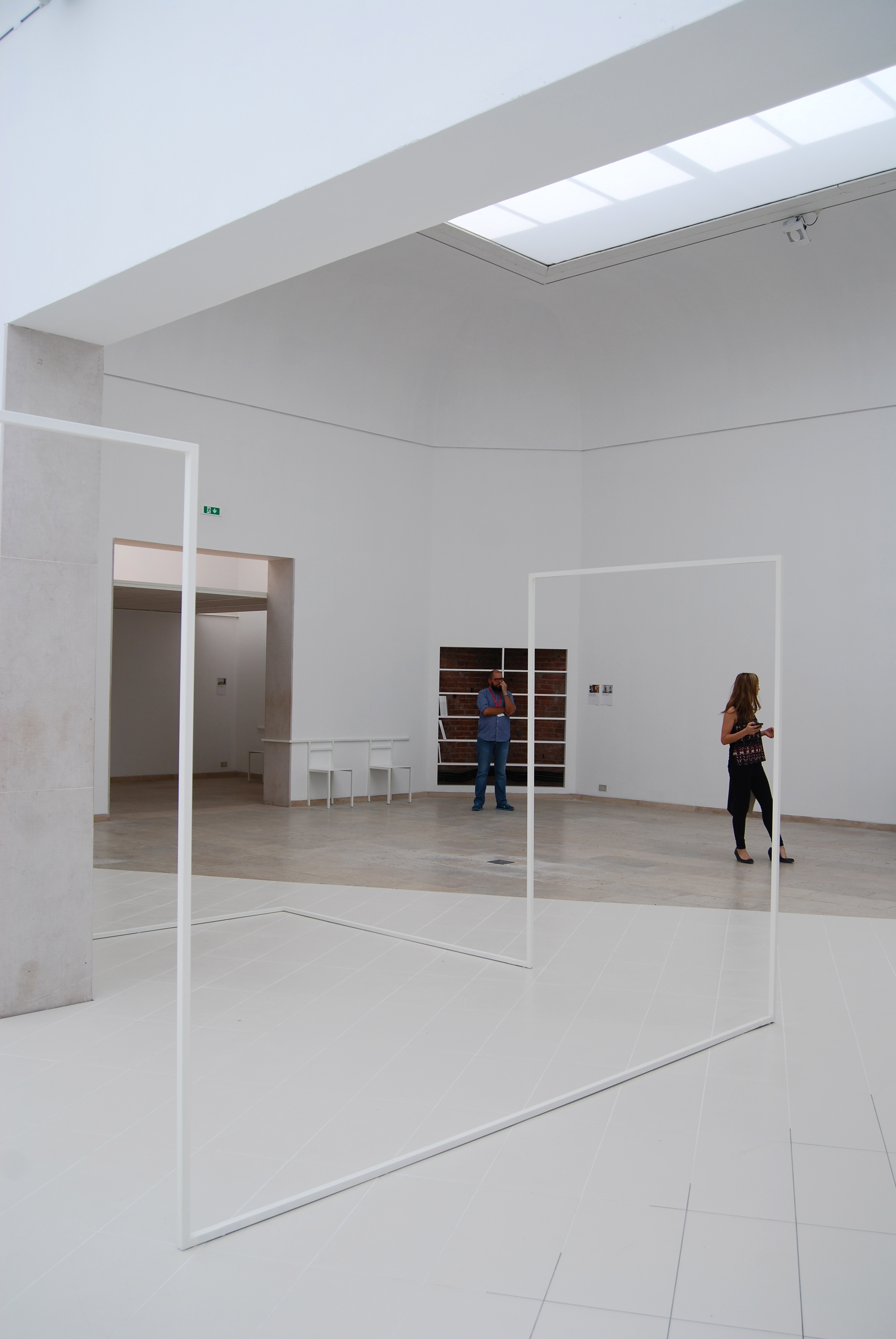
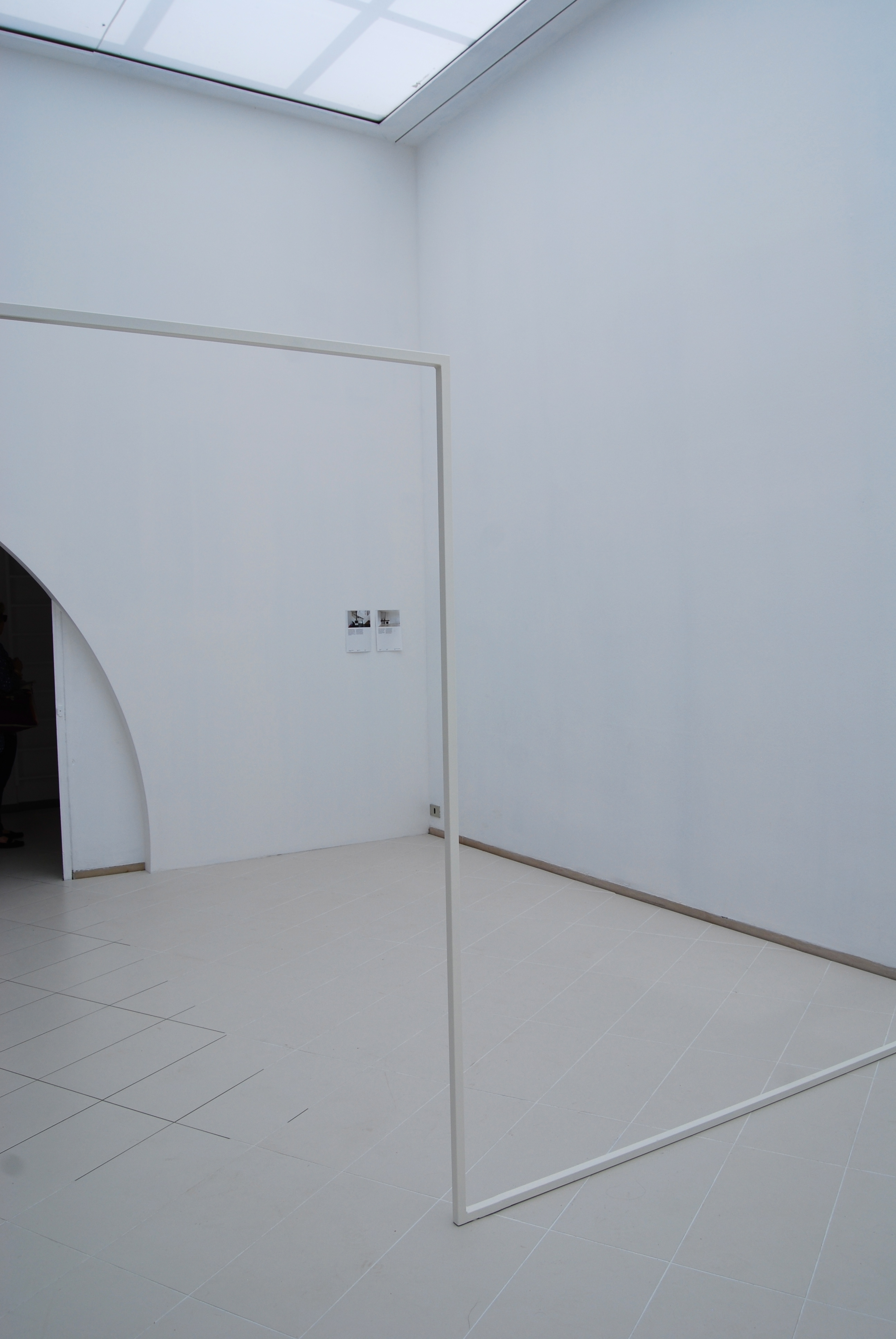
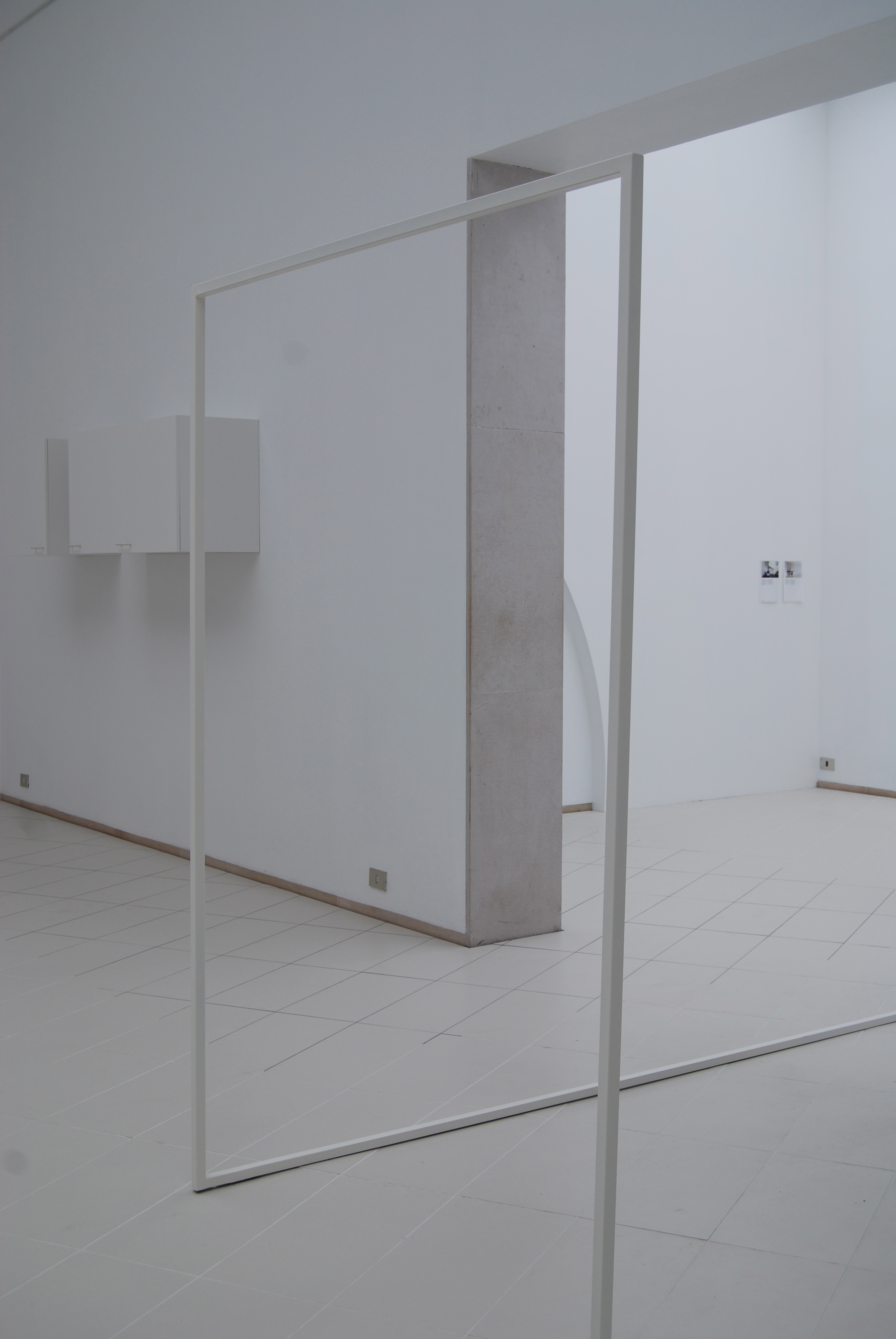
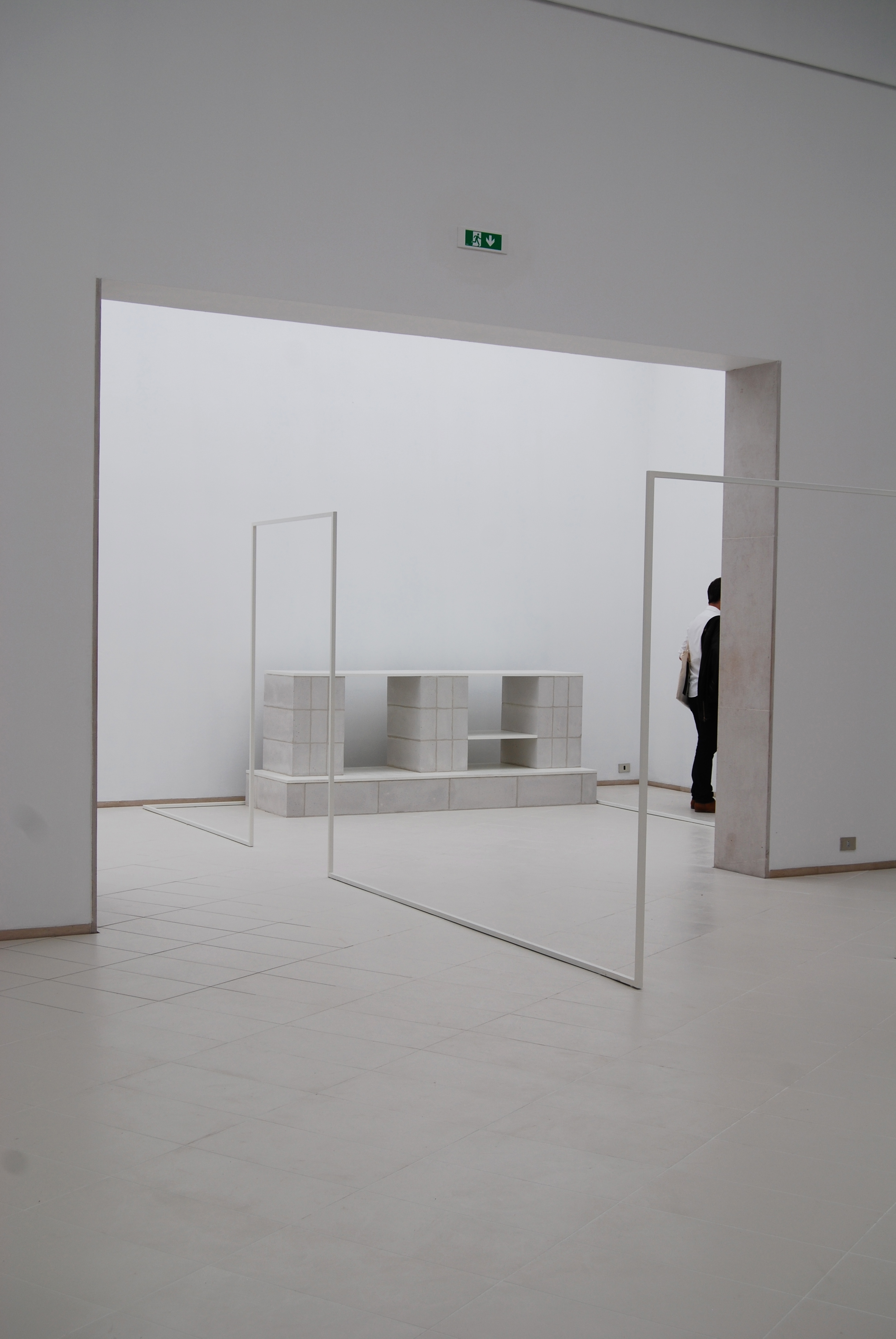
The Belgium pavilion kept it simple, cataloguing over 1000 domestic interiors and abstracting them into white architectural interventions.
6. Maison Dom-ino, Architectural Association
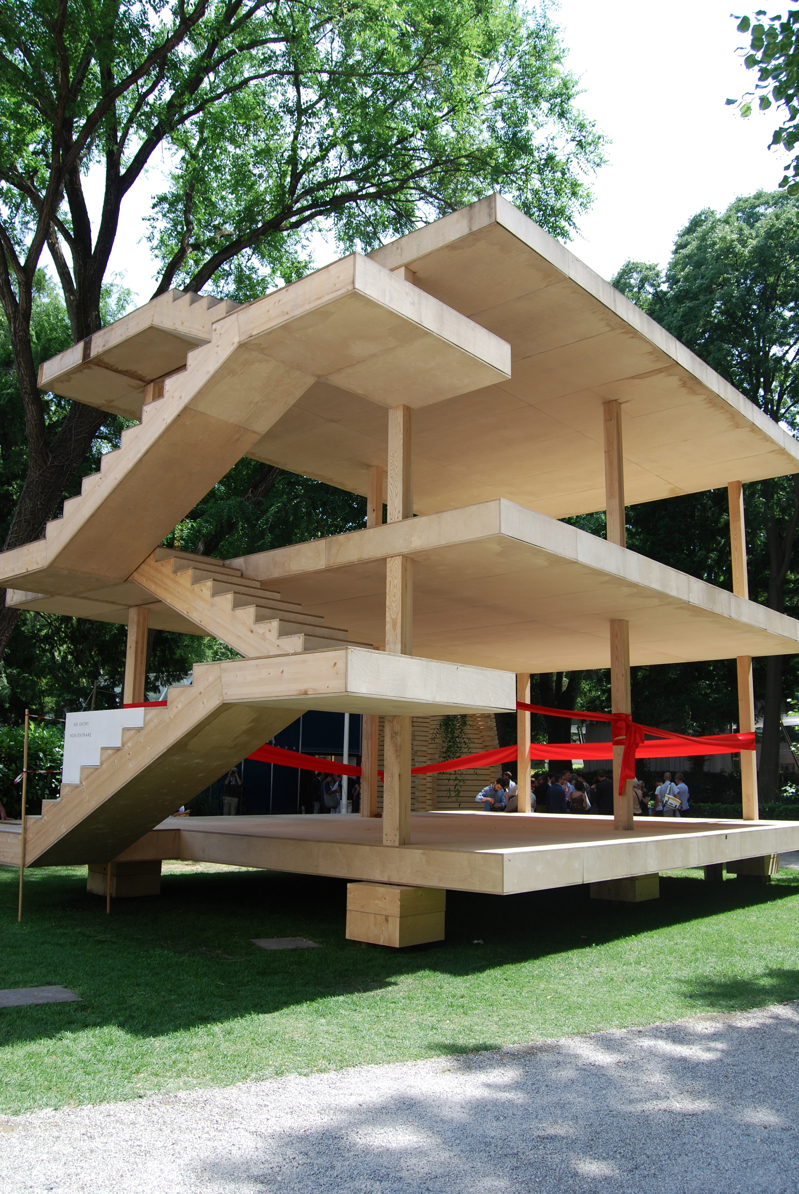
The Architectural Association and vbvb studio recreated Le Corbusier’s famous Maison Dom-ino in plywood. It was exhibited outside the Central Pavilion and was manufactured by automated machines in Switzerland.
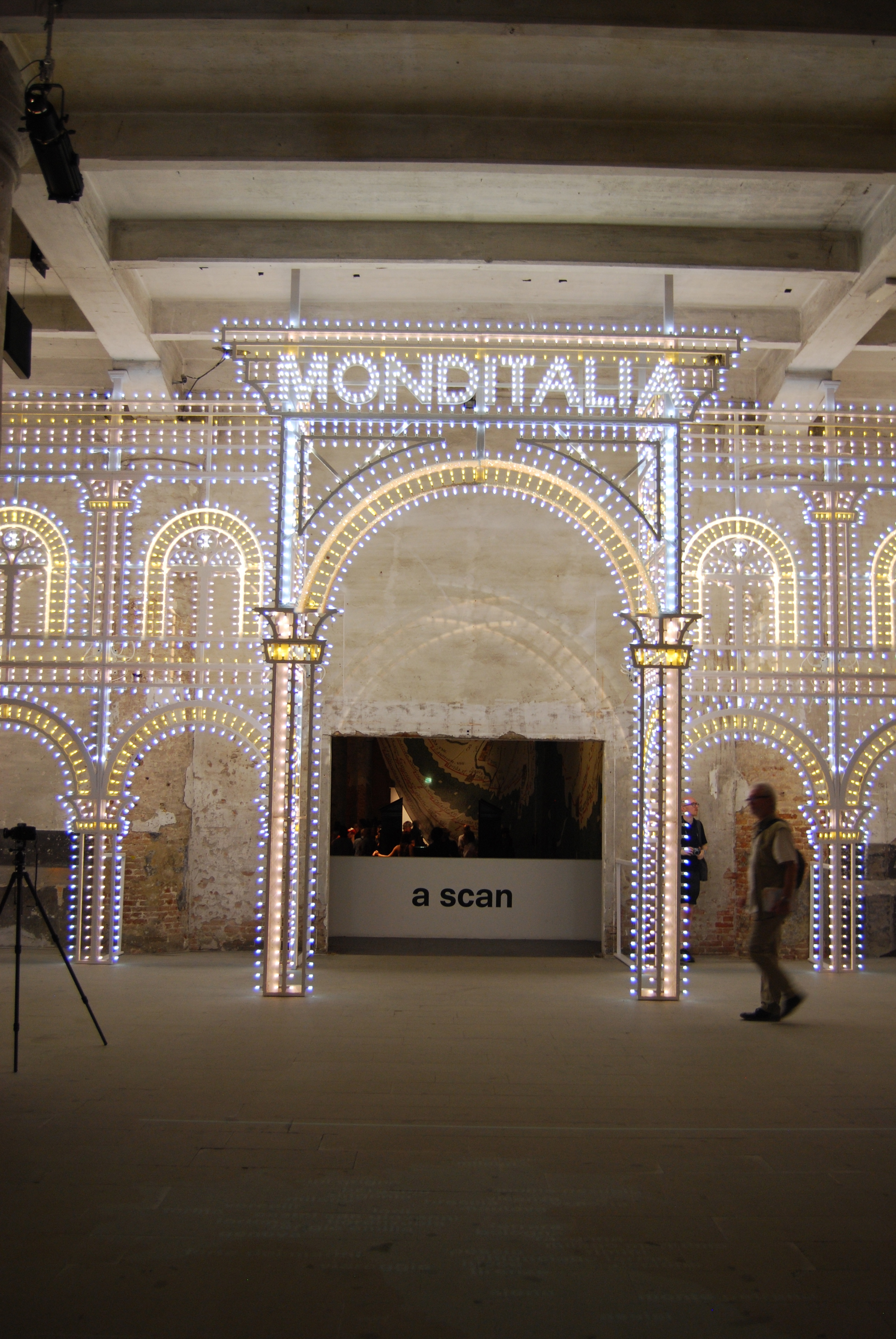
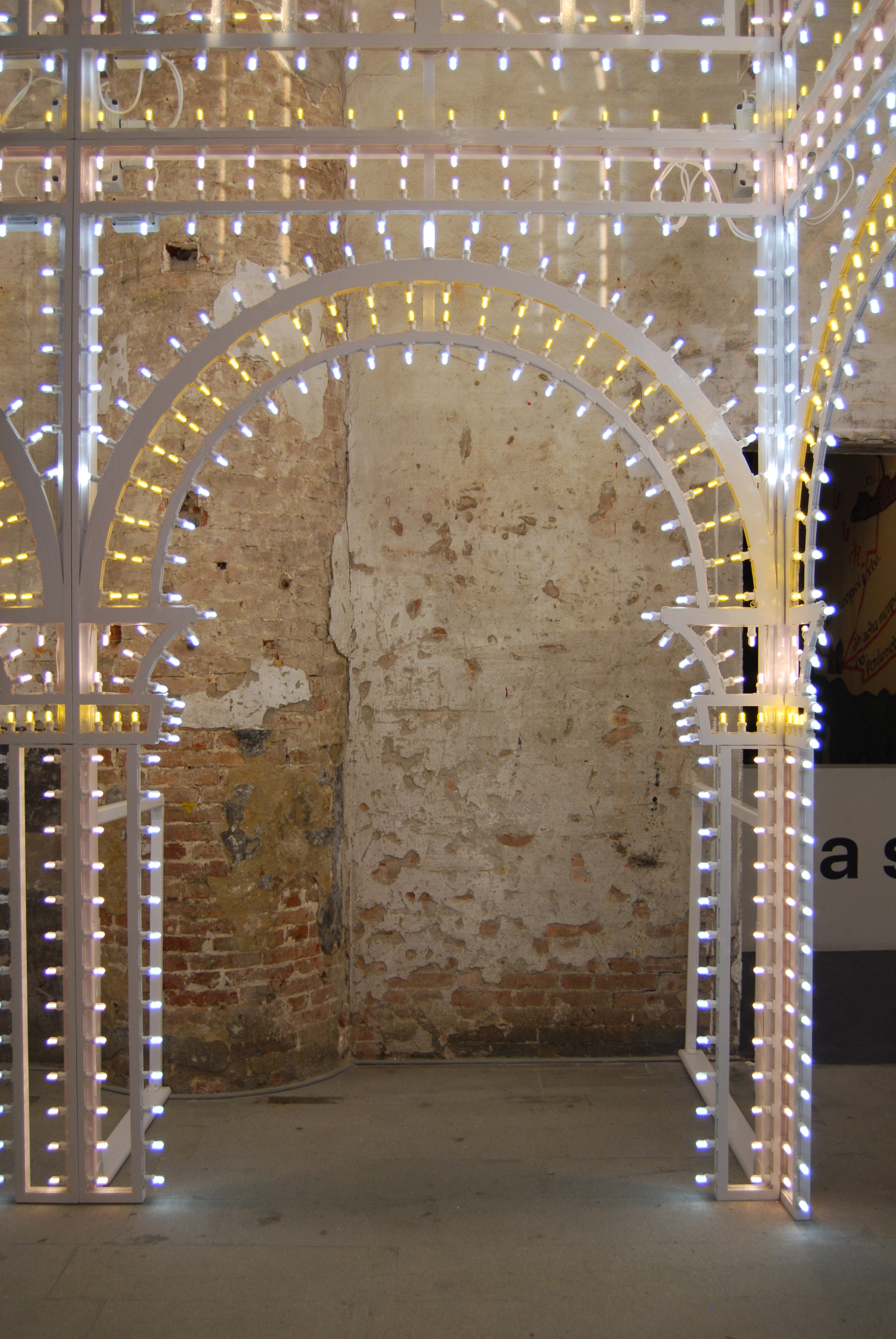
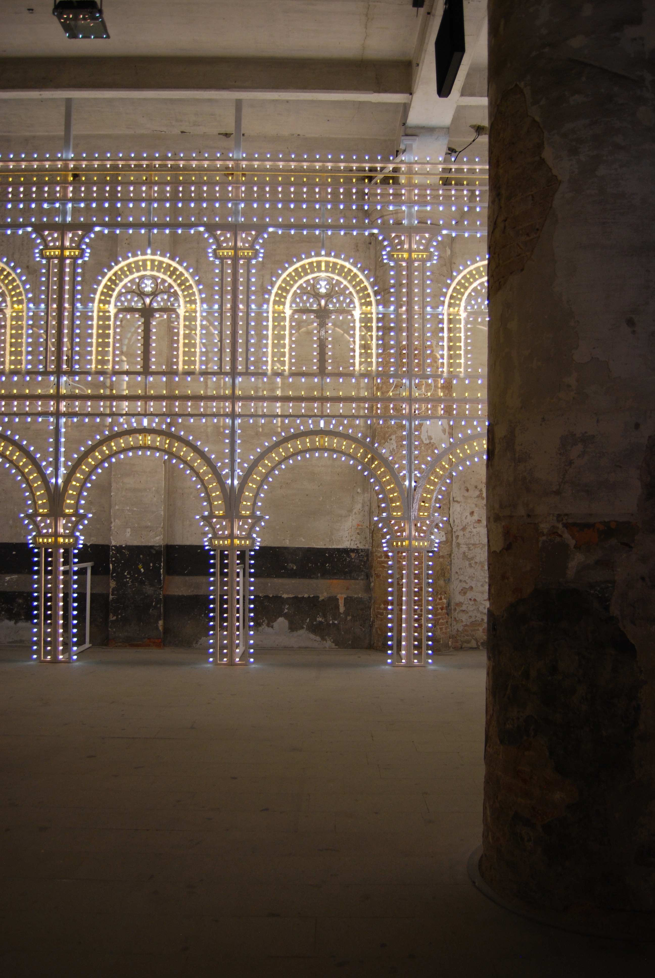
6. Monditalia, Arsenale
Monditalia in the Arsenale focused on Italy and combined dance, music, theatre and film.
Images my own

